6 weeks, Q4 2022 User Engagement, Knowledge Mangement, B2B, SaaS, Native App Research, Data Analysis, Ideation, Product Design, UX Writing, Design Documentation Figma, Miro, Jira, Confluence Scrum, Epic stories, 5W2H, Product-Led Growth Flywheel, Design Systems Stakeholder interviews, Sales and support interviews, Metrics review, Goal prioritisation, Competitive analysis, Personas, Hierarchical Task Analysis, Userflows, Wireframing, Rapid prototyping, A/B testing, Peer reviews 6 weeks, Q4 2022 User Engagement, Knowledge Management, B2B, SaaS, Native App Research, Data Analysis, Ideation, Product Design, UX Writing, Design Documentation Figma, Miro, Jira, Confluence Scrum, Epic stories, 5W2H, Product-Led Growth Flywheel, Design Systems Stakeholder interviews, Sales and support interviews, Metrics review, Goal prioritisation, Competitive analysis, Personas, Hierarchical Task Analysis, Userflows, Wireframing, Rapid prototyping, A/B testing, Peer reviews Mindset AI’s product, a fully configurable app, helps training providers scale their expertise. Different app flows can help the client deliver the next leadership workshop or provide a daily feed of mentoring content to the end user. Think, Productboard and Squarespace combined for business coaches. As app admin, each client is in charge of how the content is presented with a wide array of flows to choose from: daily check-ins, personal assessments or learning pathways among others. Mindset AI’s product, a fully configurable app, helps training providers scale their expertise. Different app flows can help the client deliver the next leadership workshop or provide a daily feed of mentoring content to the end user. Think, Productboard and Squarespace combined for business coaches. As app admin, each client is in charge of how the content is presented with a wide array of flows to choose from: daily check-ins, personal assessments or learning pathways among others. With over 1,000 monthly active users, Mindset AI’s clients needed a clearer way of understanding which flows available on the app attracted the most attention. The data for recent quarters showed that despite a growing user base, the ratio of net active users decreased. To prevent the risk of a growing churn rate, I needed to find a new method that could simultaneously drive user engagement while helping the clients gather evidence on the nature of each user interaction. For what reason would the user pick to complete one learning pathway over another? How much time did they think they needed to complete an assessment? My solution needed to provide an intuitive way of answering these questions. With over 1,000 monthly active users, Mindset AI’s clients needed a clearer way of understanding which flows available on the app attracted the most attention. The data for recent quarters showed that despite a growing user base, the ratio of net active users decreased. To prevent the risk of a growing churn rate, I needed to find a new method that could simultaneously drive user engagement while helping the clients gather evidence on the nature of each user interaction. For what reason would the user pick to complete one learning pathway over another? How much time did they think they needed to complete an assessment? My solution needed to provide an intuitive way of answering these questions. With such a complex multi-channel product, gauging the success of various content delivery methods was no easy feat. To get a holistic view of the problem, I decided to run two concurrent discovery sessions. My interviews with sales representatives at Mindset AI were product-centric and aimed at defining what channels of delivery the company suggested their clients use. In turn, my time with stakeholders had a more behavioural edge, intended to track their preferences when prompted with various user scenarios. With such a complex multi-channel product, gauging the success of various content delivery methods was no easy feat. To get a holistic view of the problem, I decided to run two concurrent discovery sessions. My interviews with sales representatives at Mindset AI were product-centric and aimed at defining what channels of delivery the company suggested their clients use. In turn, my time with stakeholders had a more behavioural edge, intended to track their preferences when prompted with various user scenarios. It was soon clear that how the clients used each channel to engage with their users was at odds with the intended purpose Mindset AI had in mind. This marked a starting point for the ideation process in our team of 4 designers. We began to think about the mentioned discrepancy of intent and use not as a risky out-of-scope predicament but as an opportunity to reevaluate how each content flow could be made more attractive in the manner that the client sees fit. It was soon clear that how the clients used each channel to engage with their users was at odds with the intended purpose Mindset AI had in mind. This marked a starting point for the ideation process in our team of 4 designers. We began to think about the mentioned discrepancy of intent and use not as a risky out-of-scope predicament but as an opportunity to reevaluate how each content flow could be made more attractive in the manner that the client sees fit. My objective during the design stage was to grant greater autonomy to the user. In order to create an unmitigated form of interaction, I used the 5W2H method which helped me visualise all possible circumstances the user might be in when using the app. Thinking about the client’s perspective, I then streamlined my options using the Product-Led Growth Flywheel, leaving only those solutions which provide enough contextual detail without interrupting the user experience. My objective during the design stage was to grant greater autonomy to the user. In order to create an unmitigated form of interaction, I used the 5W2H method which helped me visualise all possible circumstances the user might be in when using the app. Thinking about the client’s perspective, I then streamlined my options using the Product-Led Growth Flywheel, leaving only those solutions which provide enough contextual detail without interrupting the user experience. After many iterations and a series of rapid prototyping on Figma, my final design offers a way of mapping user interactions through goal tracking. The new feature allows users to save content, arrange dates of completion and set metric-related goals for assessments. On the side of the host platform, the coaching clients have now the ability to monitor the ways in which the user intends to interact with the content. Every time the user bookmarks an article or sets a minimum number of assessment steps to complete in a day, the client receives invaluable information as to what creates a buzz on the app. The new functionality prompts the user to accomplish a goal-related task, such as the completion of a self-imposed deadline with in-app notifications. Once clicked on, the notification leads the user to a goal bank where they can access and edit all the goals they attached to particular pieces of content. We devised a way to gather immediate comments on the proposed solution in the form of an alert dialogue which appeared over the interface at the end of the prototype flow. Five days into beta testing, we gathered quantitative and qualitative feedback. Both end users and app admins shared positive critiques on the goal tracking feature with 90% stating it helped them monitor and prioritise the content according to their needs. “The new solution facilitates smoother data collection that doesn’t overwhelm the user. It is a great funnel from both the candidate’s and the recruiter’s perspectives. I also appreciate the explanations included in the flow about what Utopicode does. This helps to instil trust in our mission.” After many iterations and a series of rapid prototyping on Figma, my final design offers a way of mapping user interactions through goal tracking. The new feature allows users to save content, arrange dates of completion and set metric-related goals for assessments. On the side of the host platform, the coaching clients have now the ability to monitor the ways in which the user intends to interact with the content. Every time the user bookmarks an article or sets a minimum number of assessment steps to complete in a day, the client receives invaluable information as to what creates a buzz on the app. The new functionality prompts the user to accomplish a goal-related task, such as the completion of a self-imposed deadline with in-app notifications. Once clicked on, the notification leads the user to a goal bank where they can access and edit all the goals they attached to particular pieces of content. ❯ OPPOSITE: MY “ADD DEADLINE” FLOW ALLOWS THE USER TO FORM APP-RELATED HABITS IN AN INTUITIVE AND UNOBTRUSIVE WAY. HERE, THE USER IS ABLE TO SET A REMINDER TO NEVER MISS A CHECK-IN We devised a way to gather immediate comments on the proposed solution in the form of an alert dialogue which appeared over the interface at the end of the prototype flow. Five days into beta testing, we gathered quantitative and qualitative feedback. Both end users and app admins shared positive critiques on the goal tracking feature with 90% stating it helped them monitor and prioritise the content according to their needs. “The new solution facilitates smoother data collection that doesn’t overwhelm the user. It is a great funnel from both the candidate’s and the recruiter’s perspectives. I also appreciate the explanations included in the flow about what Utopicode does. This helps to instil trust in our mission.” At the start of this project, I didn’t expect that the solution for driving user engagement that can simultaneously increase the visibility of user activity to the clients was to be found in goal tracking. My time at Mindset AI was therefore an invaluable lesson in confronting assumptions and working with many variables that a start-up environment is never short of. As part of a cross-functional team, crafting my prototype in constant collaboration with developers has also taught me how to prepare agile UX documentation. With the help of Confluence, I was able to compile a ready-to-go package that the tech team could begin working on in order to implement the solution. At the start of this project, I didn’t expect that the solution for driving user engagement that can simultaneously increase the visibility of user activity to the clients was to be found in goal tracking. My time at Mindset AI was therefore an invaluable lesson in confronting assumptions and working with many variables that a start-up environment is never short of. As part of a cross-functional team, crafting my prototype in constant collaboration with developers has also taught me how to prepare agile UX documentation. With the help of Confluence, I was able to compile a ready-to-go package that the tech team could begin working on in order to implement the solution. Mindset AI
DURATION
TYPE OF PROJECT
MY RESPONSIBILITIES
TOOLBOX
PRODUCT DESIGN FRAMEWORKS
UX METHODS
Mindset AI
DURATION
TYPE OF PROJECT
MY RESPONSIBILITIES
TOOLBOX
PRODUCT DESIGN FRAMEWORKS
UX METHODS
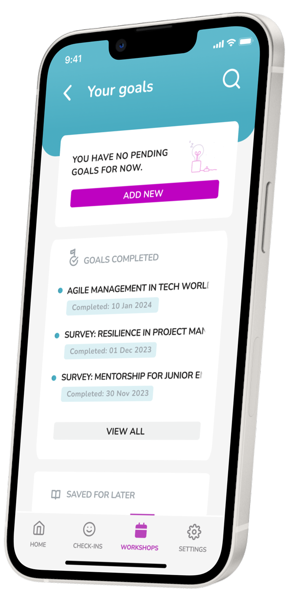

THE FLOW GUIDES THE USER THROUGH THE BENEFITS OF THE GOAL-TRACKING FUNCTIONALITY. THE WALKTHROUGH SCREENS ALONG WITH A TOOLTIP LEAD THE USER TO SET A MINIMUM SCORE AND SAVE AN ASSESSMENT TO REVIEW LATER

❮ OPPOSITE: THE FLOW GUIDES THE USER THROUGH THE BENEFITS OF THE GOAL-TRACKING FUNCTIONALITY. THE WALKTHROUGH SCREENS ALONG WITH A TOOLTIP LEAD THE USER TO SET A MINIMUM SCORE AND SAVE AN ASSESSMENT TO REVIEW LATER
Problem

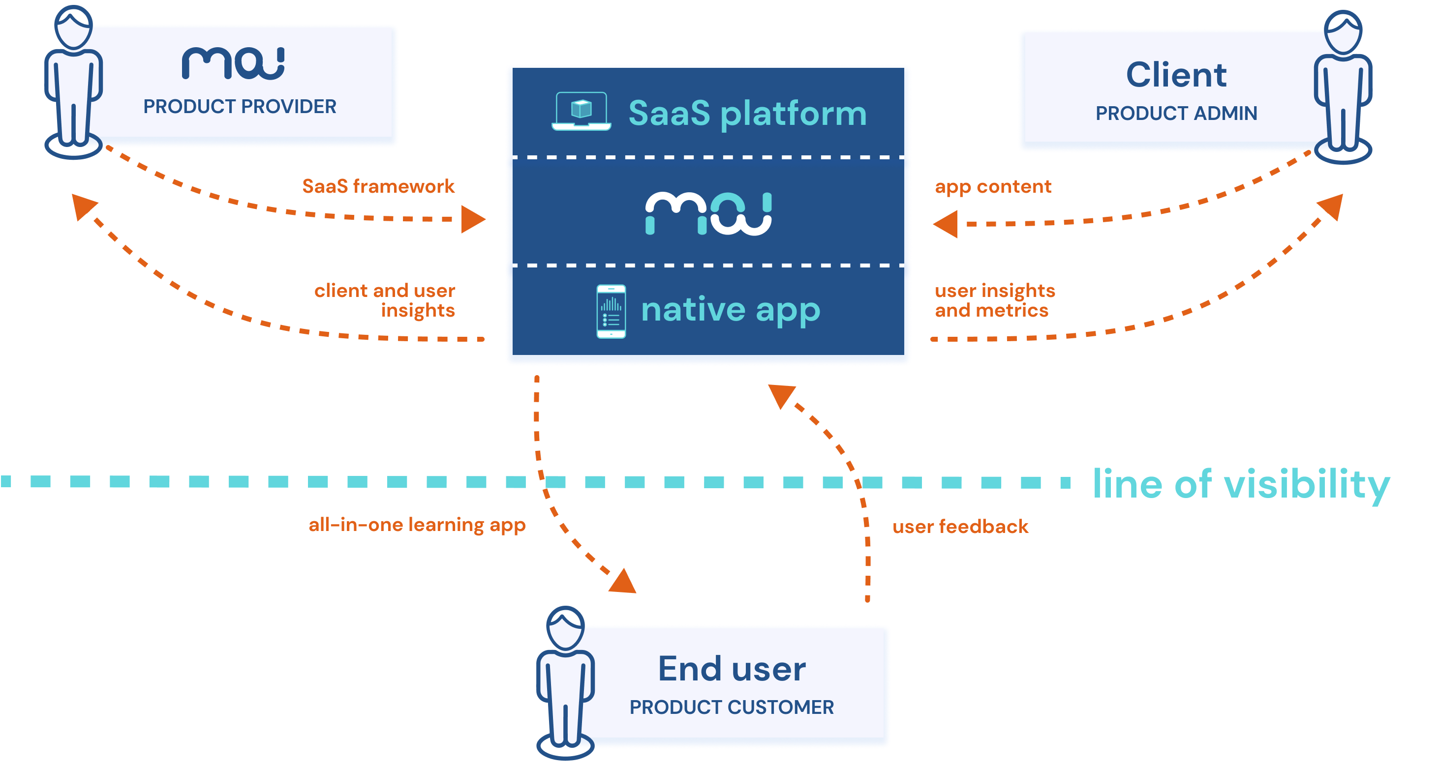
UNDERSTANDING THE COMPLEX ECOSYSTEM OF THE MINDSET AI PRODUCT WAS KEY TO SOLVING THE USER ENGAGEMENT ISSUE DOWN THE LINE
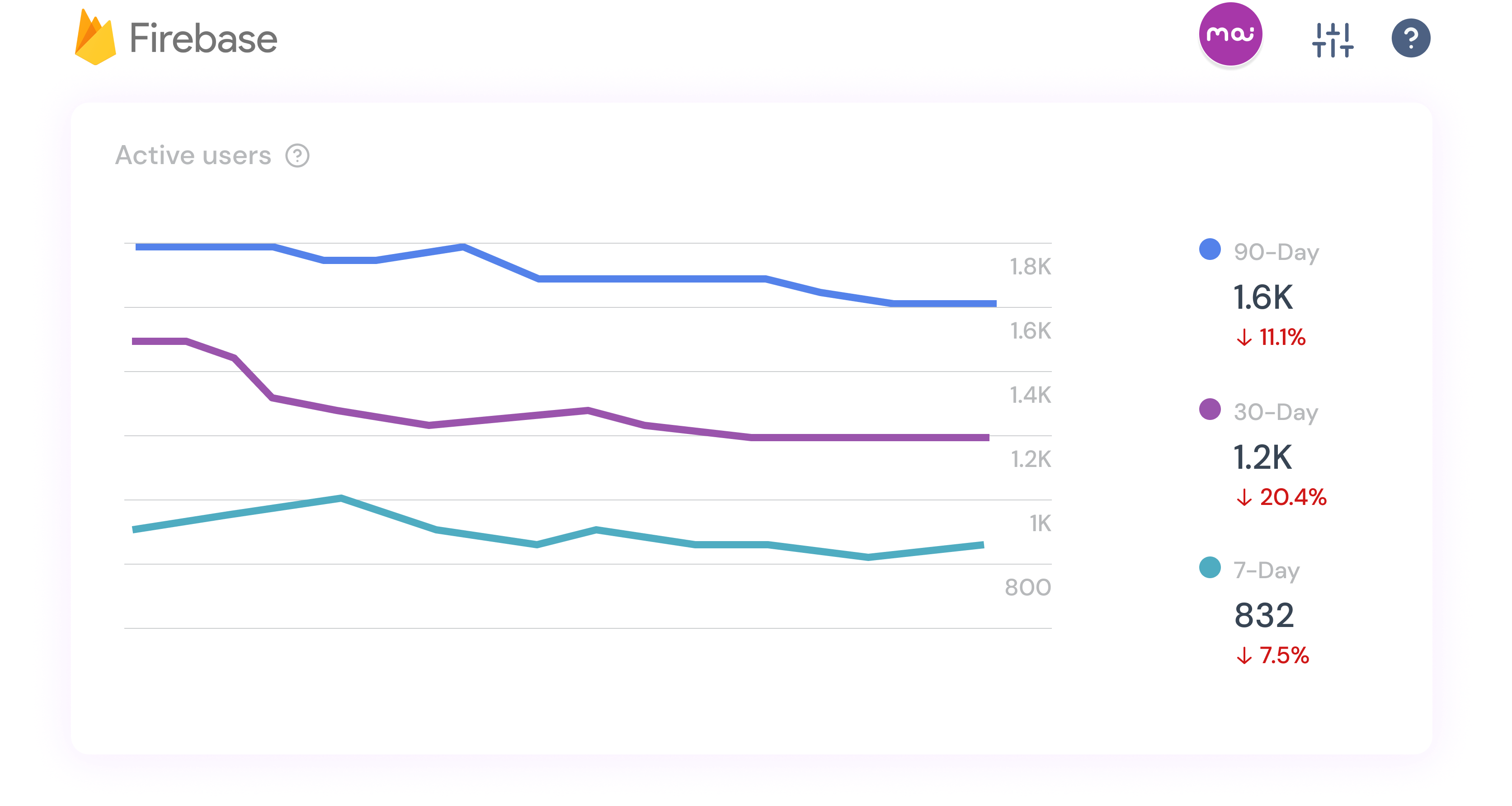
TO SOLVE THE PROBLEM OF A DWINDLING RATE AMONG ACTIVE USERS, I NEEDED TO UNDERSTAND IN WHAT CAPACITY THEY INTERACTED WITH THE DIFFERENT FORMS OF APP CONTENT

⌃ ABOVE: UNDERSTANDING THE COMPLEX ECOSYSTEM OF THE MINDSET AI PRODUCT WAS KEY TO SOLVING THE USER ENGAGEMENT ISSUE DOWN THE LINE

⌃ ABOVE: TO SOLVE THE PROBLEM OF A DWINDLING RATE AMONG ACTIVE USERS, I NEEDED TO UNDERSTAND IN WHAT CAPACITY THEY INTERACTED WITH THE DIFFERENT FORMS OF APP CONTENT
Action

Discover
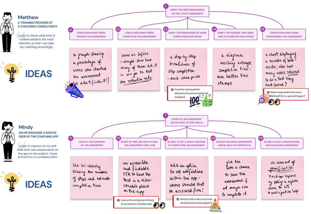
HIERARCHICAL TASK ANALYSES FOR TWO PERSONAS, MATTHEW (AN APP ADMIN) AND MINDY (AN APP END USER), GENERATED THE INITIAL CONCEPTS FOR THE FEATURES DURING OUR IDEATION SESSIONS
Discover

⌃ ABOVE: HIERARCHICAL TASK ANALYSES FOR TWO PERSONAS, MATTHEW (AN APP ADMIN) AND MINDY (AN APP END USER), GENERATED THE INITIAL CONCEPTS FOR THE FEATURES DURING OUR IDEATION SESSIONS
Define
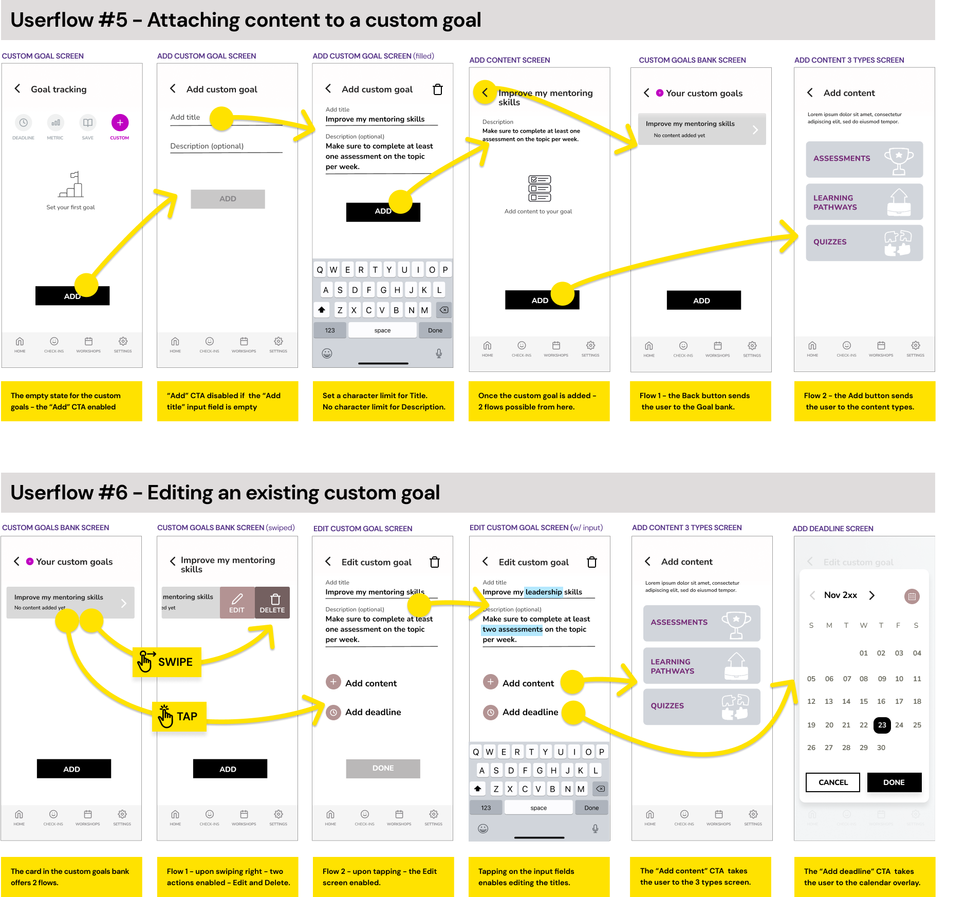
NEARING THE END OF THE IDEATION STAGE, I STARTED SHARING WITH MY TEAM MEMBERS THE USERFLOWS TO REPRESENT HOW GOAL-TRACKING TACTICS COULD ADDRESS THE USER NEEDS. HERE, MY EARLY LOW-FI ITERATIONS OF CUSTOM GOALS
Define

⌃ ABOVE: NEARING THE END OF THE IDEATION STAGE, I STARTED SHARING WITH MY TEAM MEMBERS THE USERFLOWS TO REPRESENT HOW GOAL-TRACKING TACTICS COULD ADDRESS THE USER NEEDS. HERE, MY EARLY LOW-FI ITERATIONS OF CUSTOM GOALS
Design
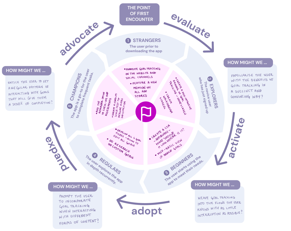
A PRODUCT-LED GROWTH FLYWHEEL ELABORATED BY OUR DESIGN TEAM HELPED ME NAVIGATE THE PROCESS OF STREAMLINING MY WORK. WITH THE MODEL IN MIND, I CARRIED ON PROTOTYPING ONLY THOSE FEATURES THAT WOULD IMPROVE THE PRODUCT IN THE MOST EFFICIENT WAY WITH THE MAXIMUM IMPACT ON THE USER EXPERIENCE
Design

⌃ ABOVE: A PRODUCT-LED GROWTH FLYWHEEL ELABORATED BY OUR DESIGN TEAM HELPED ME NAVIGATE THE PROCESS OF STREAMLINING MY WORK. WITH THE MODEL IN MIND, I CARRIED ON PROTOTYPING ONLY THOSE FEATURES THAT WOULD IMPROVE THE PRODUCT IN THE MOST EFFICIENT WAY WITH THE MAXIMUM IMPACT ON THE USER EXPERIENCE
Result

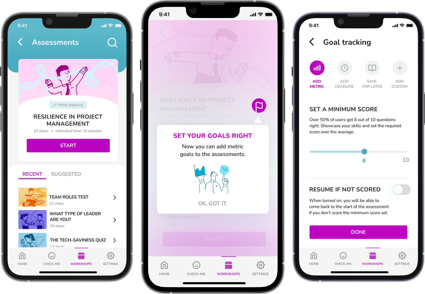
A TOOLTIP NAVIGATES THE USER FROM THE ASSESSMENT SCREEN TO THE GOAL-TRACKING FEATURE WHERE THE USER IS ABLE TO SET A MINIMUM SCORE TO ACHIEVE

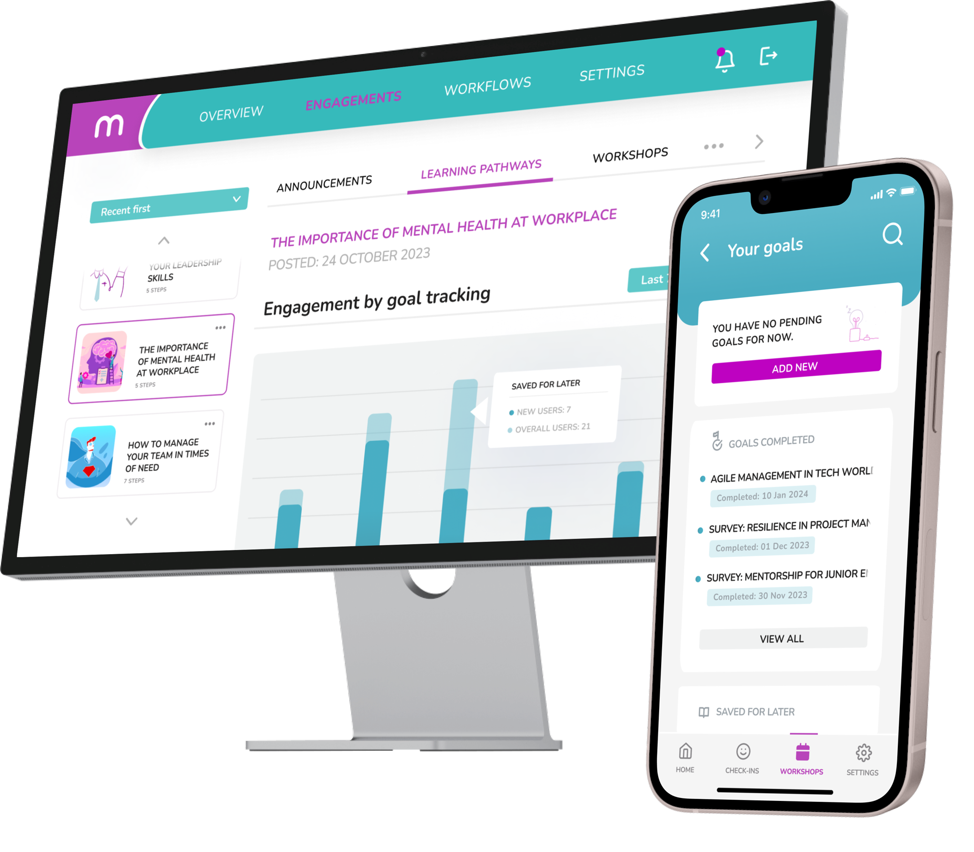
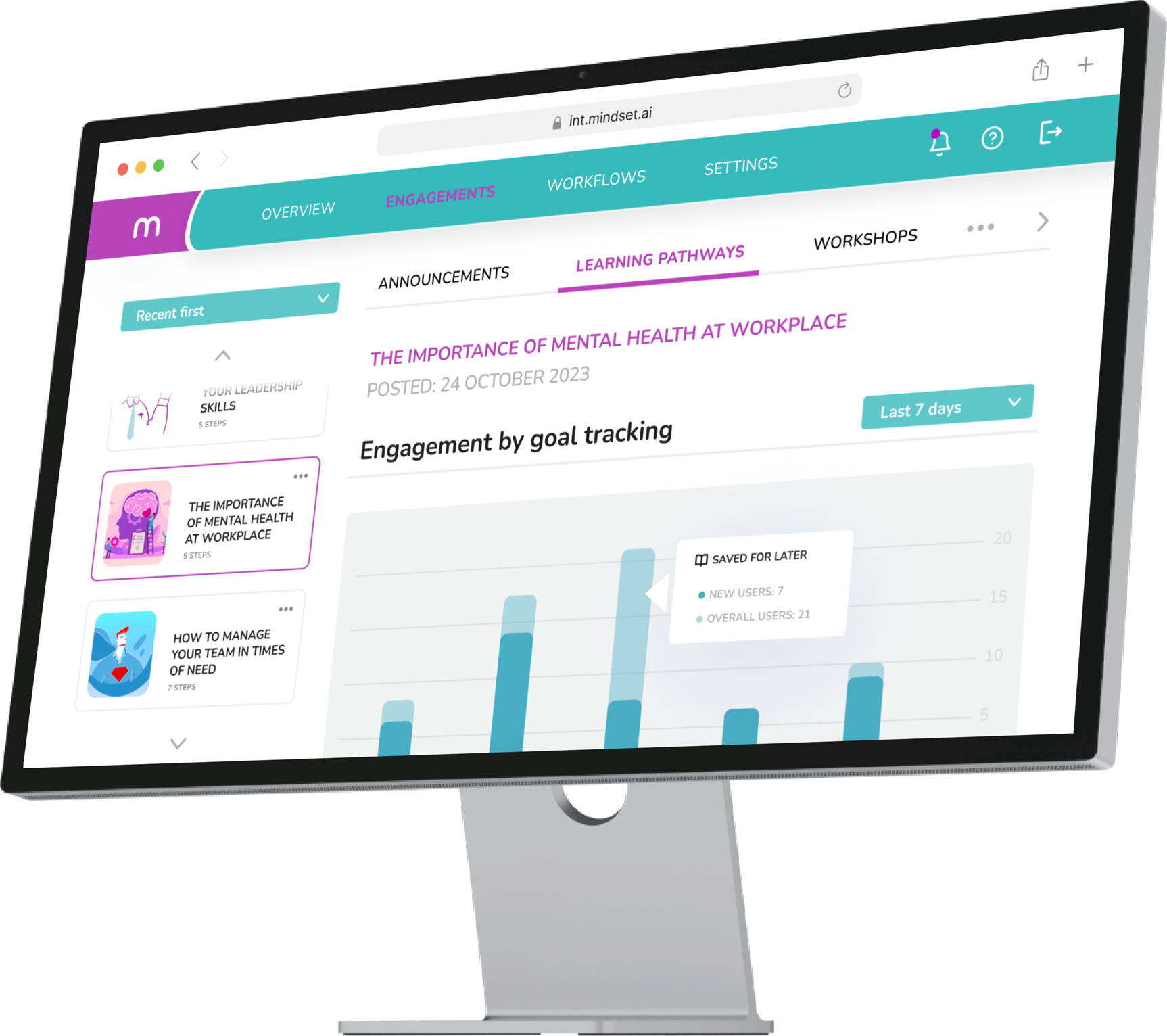
ON THE APP ADMIN PLATFORM, MY AIM WAS TO GATHER THE MOST PERTINENT QUALITATIVE AND QUANTITIVE FEEDBACK IN ONE PLACE FOR THE ADMIN’S CONVENIENCE. THE INTERFACE SHOWS WHICH PIECE OF CONTENT ON THE APP GAINS TRACTION AND FLESHES OUT THE DETAILS OF USER INTERACTIONS

MY “ADD DEADLINE” FLOW ALLOWS THE USER TO FORM APP-RELATED HABITS IN AN INTUITIVE AND UNOBTRUSIVE WAY. HERE, THE USER IS ABLE TO SET A REMINDER TO NEVER MISS A CHECK-IN

Fernando Poli
UX/UI DESIGNER AT UTOPICODE

⌃ ABOVE: A TOOLTIP NAVIGATES THE USER FROM THE ASSESSMENT SCREEN TO THE GOAL-TRACKING FEATURE WHERE THE USER IS ABLE TO SET A MINIMUM SCORE TO ACHIEVE

❮ OPPOSITE: ON THE APP ADMIN PLATFORM, MY AIM WAS TO GATHER THE MOST PERTINENT QUALITATIVE AND QUANTITIVE FEEDBACK IN ONE PLACE FOR THE ADMIN’S CONVENIENCE. THE INTERFACE SHOWS WHICH PIECE OF CONTENT ON THE APP GAINS TRACTION AND FLESHES OUT THE DETAILS OF USER INTERACTIONS


Fernando Poli
UX/UI DESIGNER AT UTOPICODE
What I learned


See more of my work
ONBOARDING
WEB SOLUTIONS
DESIGN SYSTEMS
See more of my work
E-COMMERCE
NATIVE APPS

ONBOARDING

WEB SOLUTIONS

DESIGN SYSTEMS

Problem

Action

Result

What I learned


