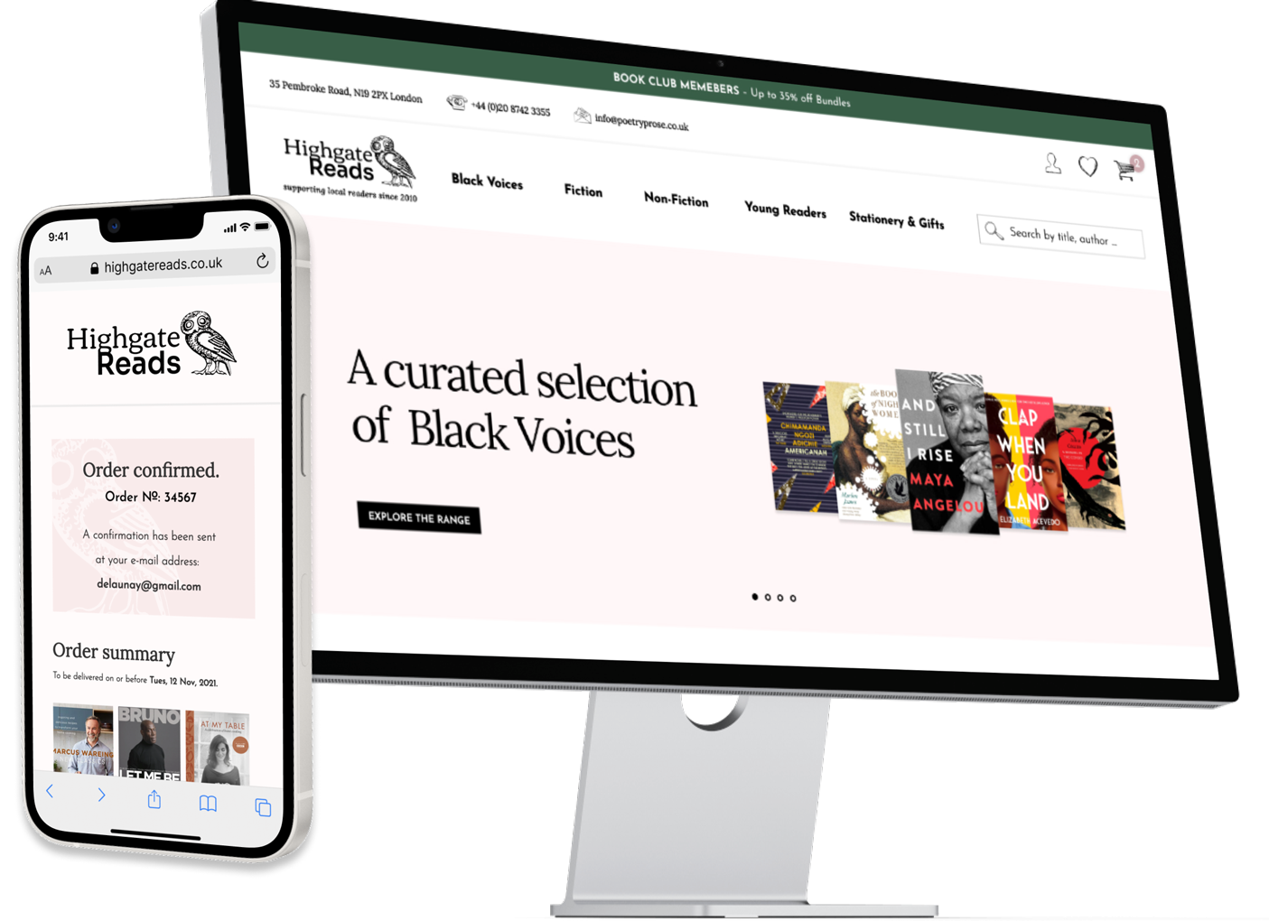
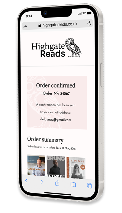
3 weeks, Q4 2021 Responsive e-commerce website, Business-to-customer (B2C) Research, Information Architecture, Product Design, UX Strategy, UI Design, Testing Figma, Adobe Illustrator, Adobe Photoshop, UXtweak Moscow method, Eisenhower method, Ishikawa diagram User interviews, Affinity mapping, Brand sprint, Competitive and comparative analysis, Task analysis, Persona building, Userflow, User stories, Card sorting, Tree testing, Prototype feedback session, Qualitative usability testing 3 weeks, Q4 2021 Responsive e-commerce website, Business-to-customer (B2C) Research, Information Architecture, Product Design, UX Strategy, UI Design, Testing Figma, Adobe Illustrator, Adobe Photoshop, UXtweak Moscow method, Eisenhower method, Ishikawa diagram User interviews, Affinity mapping, Brand sprint, Competitive and comparative analysis, Task analysis, Persona building, Userflow, User stories, Card sorting, Tree testing, Prototype feedback session, Qualitative usability testing WHEN DESIGNING THE HOME PAGE, I WANTED TO FOCUS ON THE CLARITY AND SIMPLICITY OF THE CARD STRUCTURE FOR THE PRODUCT DISPLAY. ONCE THE GRID WAS SET IN PLACE, I WAS ABLE TO WEAVE IN OTHER ELEMENTS OF THE UI, SUCH AS THE TOP HERO BANNER London’s neighbourhood bookseller, Highgate Reads, created their own website in the 2010s. Its primary purpose was to advertise the events hosted by the bookshop. Now, the owners wanted to turn their online presence into tangible profit and sell more books online. To boost their e-commerce platform, I embarked on a three-week sprint that helped me create a new brand identity consolidated in a high–fidelity checkout flow. London’s neighbourhood bookseller, Highgate Reads, created their own website in the 2010s. Its primary purpose was to advertise the events hosted by the bookshop. Now, the owners wanted to turn their online presence into tangible profit and sell more books online. To boost their e-commerce platform, I embarked on a three-week sprint that helped me create a new brand identity consolidated in a high–fidelity checkout flow. Although the Highgate Reads site already offered a rudimentary shopping experience, the business had to seek new ways of securing the transactions. Despite the high online traffic, very few purchases were actually finalised. This problem called for a more optimal e-commerce experience whose success would be measured by an increased rate of completed orders. The client has also reported that their in-store customers would give feedback on the website. The reoccurring complaint was that the clarity of the e-shop left a lot to be desired. Customers struggled to find the book they wanted to buy online and often were surprised to find it in a genre category that they believed was wrong. Although the Highgate Reads site already offered a rudimentary shopping experience, the business had to seek new ways of securing the transactions. Despite the high online traffic, very few purchases were actually finalised. This problem called for a more optimal e-commerce experience whose success would be measured by an increased rate of completed orders. The client has also reported that their in-store customers would give feedback on the website. The reoccurring complaint was that the clarity of the e-shop left a lot to be desired. Customers struggled to find the book they wanted to buy online and often were surprised to find it in a genre category that they believed was wrong. Since my client’s customer range focused primarily on local shoppers, I decided to run a series of user interviews as the best way to gain a first-hand insight into the habits and needs of local customers. To track the key trends from these interviews, I synthesised the main trends in an affinity mapping exercise. Later, the Ishikawa diagram helped me realise how varied the reasons for not completing an online purchase can be. Since my client’s customer range focused primarily on local shoppers, I decided to run a series of user interviews as the best way to gain a first-hand insight into the habits and needs of local customers. To track the key trends from these interviews, I synthesised the main trends in an affinity mapping exercise. Later, the Ishikawa diagram helped me realise how varied the reasons for not completing an online purchase can be. At this stage, I compiled a brand sprint, comparative and competitive analysis of my client’s key competitors as well as delivered two digital personas based on the insights from my interviews. For each of them, I generated a journey map of their future online experience, from entering the site to completing the purchase. At this stage, I compiled a brand sprint, comparative and competitive analysis of my client’s key competitors as well as delivered two digital personas based on the insights from my interviews. For each of them, I generated a journey map of their future online experience, from entering the site to completing the purchase. It was now time to think of how the MVP might address the problem of books found in mismatched genre categories. I solved this issue by running a tree testing session and a card sorting survey via UX Tweak. The survey results gave me a better understanding of customers’ expectations regarding the shop inventory. This was an invaluable lesson while crafting the information architecture of the new product. It was now time to think of how the MVP might address the problem of books found in mismatched genre categories. I solved this issue by running a tree testing session and a card sorting survey via UX Tweak. The survey results gave me a better understanding of customers’ expectations regarding the shop inventory. This was an invaluable lesson while crafting the information architecture of the new product. A clickable prototype of the home, product, checkout and contact pages was created on Figma. The new interface of the website with clear and engaging calls for action along with accessible filters and a more intuitive organisation of product inventory improves the clarity of where the user is supposed to go in order to complete a purchase. THE USER IS ABLE TO FILTER THROUGH THE RESULTS BY BEST REVIEWS. A CLEAR DISPLAY OF THE PRODUCT OFFERS ENOUGH DETAILS ON THE BOOK WITHOUT CLUTTERING THE SPACE. WHEN IN DOUBT, THE USER CAN REACH OUT TO THE SELLER THROUGH THE CONTACT PAGE The addition of a quick add button along with an inset basket menu in the top right corner of the website addressed the problem of scarce purchases made on the site stated in the brief. THE LION’S SHARE OF MY WORK CONSISTED OF REBUILDING THE INFORMATION ARCHITECTURE OF THE WEBSITE TO CREATE A CLEAR AND NAVIGABLE ENVIRONMENT FOR SHOPPING ONLINE I developed an appetising way to display products and give customers a clear way to find new items tailored to their needs. The brand identity I elaborated with the new site highlighted a personable and communitarian feel of the bookshop. THE FINAL PROTOTYPE OF THE E-COMMERCE SITE HAD TO INCLUDE A USER-FRIENDLY WAY TO COMPLETE THE PAYMENT. THE INTRODUCTION OF THE PROGRESS BAR AT THE TOP OF THE SCREEN WAS A WAY TO MAKE THE PROCESS SMOOTHER AND MORE TRANSPARENT TO THE USER The feedback received in unmoderated testing rounds pointed at the user’s enthusiasm for completing the purchase in a more navigable environment. The benchmark set at 1.5 minutes for the task of looking up and buying a book was met by 9 out of 10 users. “The new solution facilitates smoother data collection that doesn’t overwhelm the user. It is a great funnel from both the candidate’s and the recruiter’s perspectives. I also appreciate the explanations included in the flow about what Utopicode does. This helps to instil trust in our mission.” A clickable prototype of the home, product, checkout and contact pages was created on Figma. The new interface of the website with clear and engaging calls for action along with accessible filters and a more intuitive organisation of product inventory improves the clarity of where the user is supposed to go in order to complete a purchase. The addition of a quick add button along with an inset basket menu in the top right corner of the website addressed the problem of scarce purchases made on the site stated in the brief. I developed an appetising way to display products and give customers a clear way to find new items tailored to their needs. The brand identity I elaborated with the new site highlighted a personable and communitarian feel of the bookshop. ❯ OPPOSITE: THE FINAL PROTOTYPE OF THE E-COMMERCE SITE HAD TO INCLUDE A USER-FRIENDLY WAY TO COMPLETE THE PAYMENT. THE INTRODUCTION OF THE PROGRESS BAR AT THE TOP OF THE SCREEN WAS A WAY TO MAKE THE PROCESS SMOOTHER AND MORE TRANSPARENT TO THE USER The feedback received in unmoderated testing rounds pointed at the user’s enthusiasm for completing the purchase in a more navigable environment. The benchmark set at 1.5 minutes for the task of looking up and buying a book was met by 9 out of 10 users. “The new solution facilitates smoother data collection that doesn’t overwhelm the user. It is a great funnel from both the candidate’s and the recruiter’s perspectives. I also appreciate the explanations included in the flow about what Utopicode does. This helps to instil trust in our mission.” I was able to quickly implement new UX methods in my iterative process. I was a novice when it came to building the information architecture of a new website. Using the card sorting method was a lesson in applying techniques I wasn’t familiar with to the MVP. Secondly, I understood how the UX-geared elements of the process, including research and wireframing, complemented the visual side of the project at the UI development stage. Small interface tweaks can help the users move through the checkout with more enthusiasm and speed. I was able to quickly implement new UX methods in my iterative process. I was a novice when it came to building the information architecture of a new website. Using the card sorting method was a lesson in applying techniques I wasn’t familiar with to the MVP. Secondly, I understood how the UX-geared elements of the process, including research and wireframing, complemented the visual side of the project at the UI development stage. Small interface tweaks can help the users move through the checkout with more enthusiasm and speed. Highgate Reads
DURATION
TYPE OF PROJECT
MY RESPONSIBILITIES
TOOLBOX
PRODUCT DESIGN FRAMEWORKS
UX METHODS
Highgate Reads
DURATION
TYPE OF PROJECT
MY RESPONSIBILITIES
TOOLBOX
PRODUCT DESIGN FRAMEWORKS
UX METHODS
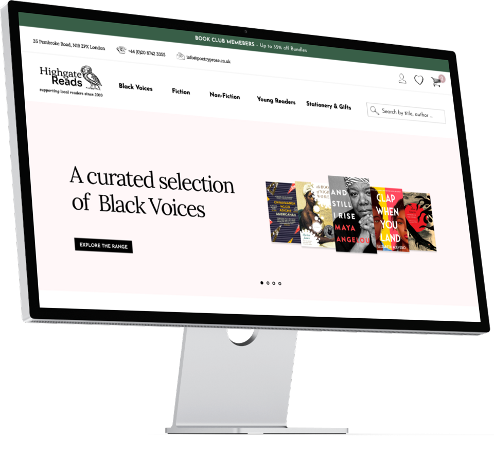


❮ OPPOSITE: WHEN DESIGNING THE HOME PAGE, I WANTED TO FOCUS ON THE CLARITY AND SIMPLICITY OF THE CARD STRUCTURE FOR THE PRODUCT DISPLAY. ONCE THE GRID WAS SET IN PLACE, I WAS ABLE TO WEAVE IN OTHER ELEMENTS OF THE UI, SUCH AS THE TOP HERO BANNER
Problem

Visit-to-purchase conversion rate
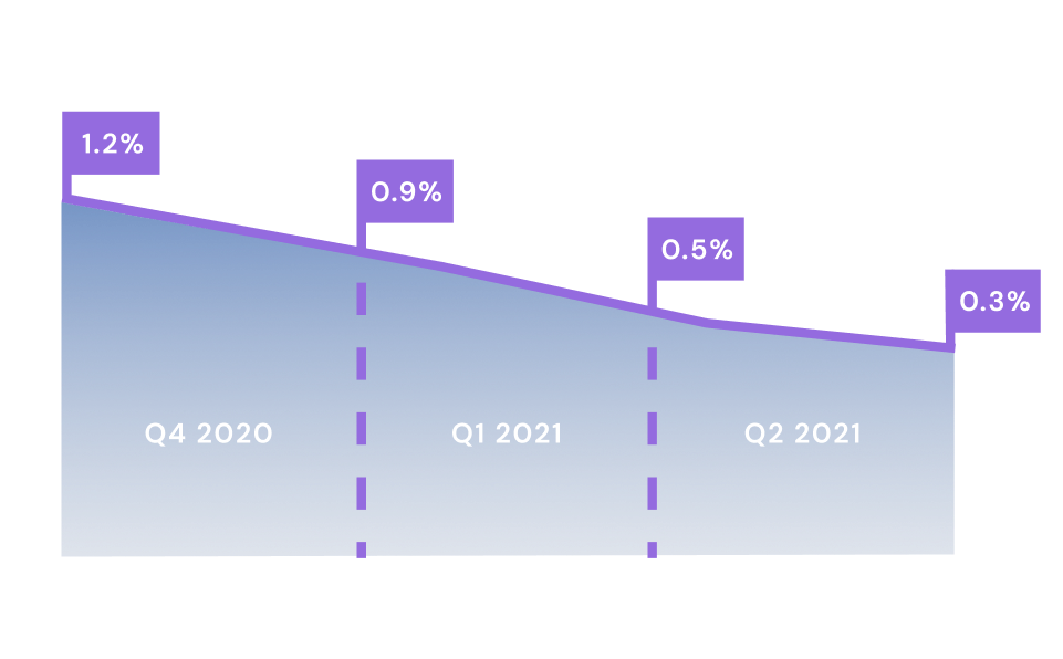
SOURCE: HIGHGATE READS / GENERAL ASSEMBLY
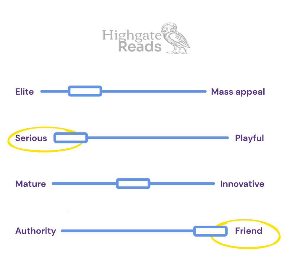
THE BRAND SPRINT HELPED ME STEER THE FUTURE SITE INTO A NEW DIRECTION THAT HIGHLIGHTED THE SHOP’S USP, A MIX OF FRIENDLINESS AND REPUTABILITY
Visit-to-purchase conversion rate

SOURCE: HIGHGATE READS / GENERAL ASSEMBLY

⌃ ABOVE: THE BRAND SPRINT HELPED ME STEER THE FUTURE SITE INTO A NEW DIRECTION THAT HIGHLIGHTED THE SHOP’S USP, A MIX OF FRIENDLINESS AND REPUTABILITY
Action

Discover
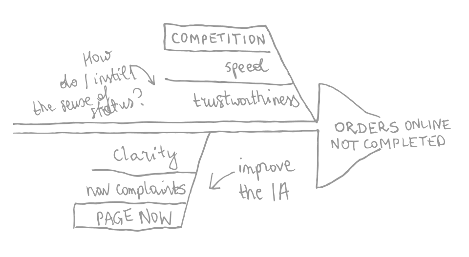
AN EXCERPT FROM THE ISHIKAWA DIAGRAM SHOWS HOW VARIED THE REASONS FOR NOT COMPLETING A PURCHASE MIGHT BE
Discover

⌃ ABOVE: AN EXCERPT FROM THE ISHIKAWA DIAGRAM SHOWS HOW VARIED THE REASONS FOR NOT COMPLETING A PURCHASE MIGHT BE
Define
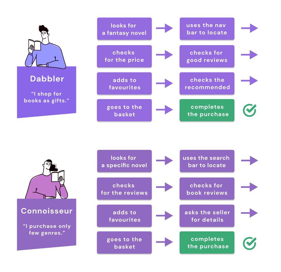
MAPPING THE ONLINE JOURNEY OF TWO DIGITAL PERSONAS THAT HAVE CRYSTALLISED DURING MY RESEARCH
Define

⌃ ABOVE: MAPPING THE ONLINE JOURNEY OF TWO DIGITAL PERSONAS THAT HAVE CRYSTALLISED DURING MY RESEARCH
Design
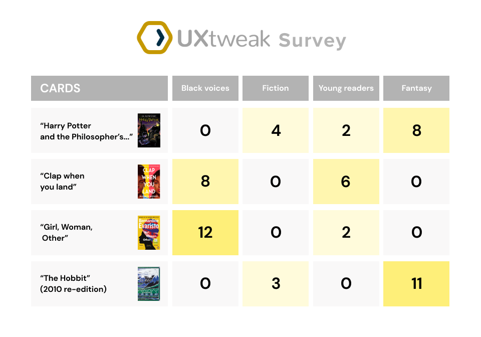
CARD SORTING OF THE SHOP’S INVENTORY WAS A BUILDING BLOCK OF THE INFORMATION ARCHITECTURE OF THE FUTURE PRODUCT
Design

⌃ ABOVE: CARD SORTING OF THE SHOP’S INVENTORY WAS A BUILDING BLOCK OF THE INFORMATION ARCHITECTURE OF THE FUTURE PRODUCT
Result




Fernando Poli
UX/UI DESIGNER AT UTOPICODE

⌃ ABOVE: THE USER IS ABLE TO FILTER THROUGH THE RESULTS BY BEST REVIEWS. A CLEAR DISPLAY OF THE PRODUCT OFFERS ENOUGH DETAILS ON THE BOOK WITHOUT CLUTTERING THE SPACE. WHEN IN DOUBT, THE USER CAN REACH OUT TO THE SELLER THROUGH THE CONTACT PAGE

❮ OPPOSITE: THE LION’S SHARE OF MY WORK CONSISTED OF REBUILDING THE INFORMATION ARCHITECTURE OF THE WEBSITE TO CREATE A CLEAR AND NAVIGABLE ENVIRONMENT FOR SHOPPING ONLINE


Fernando Poli
UX/UI DESIGNER AT UTOPICODE
What I learned


See more of my work
ONBOARDING
WEB SOLUTIONS
DESIGN SYSTEMS
See more of my work
NATIVE APPS
WEB SOLUTIONS

SaaS

DESIGN SYSTEMS

Problem

Action

Result

What I learned


