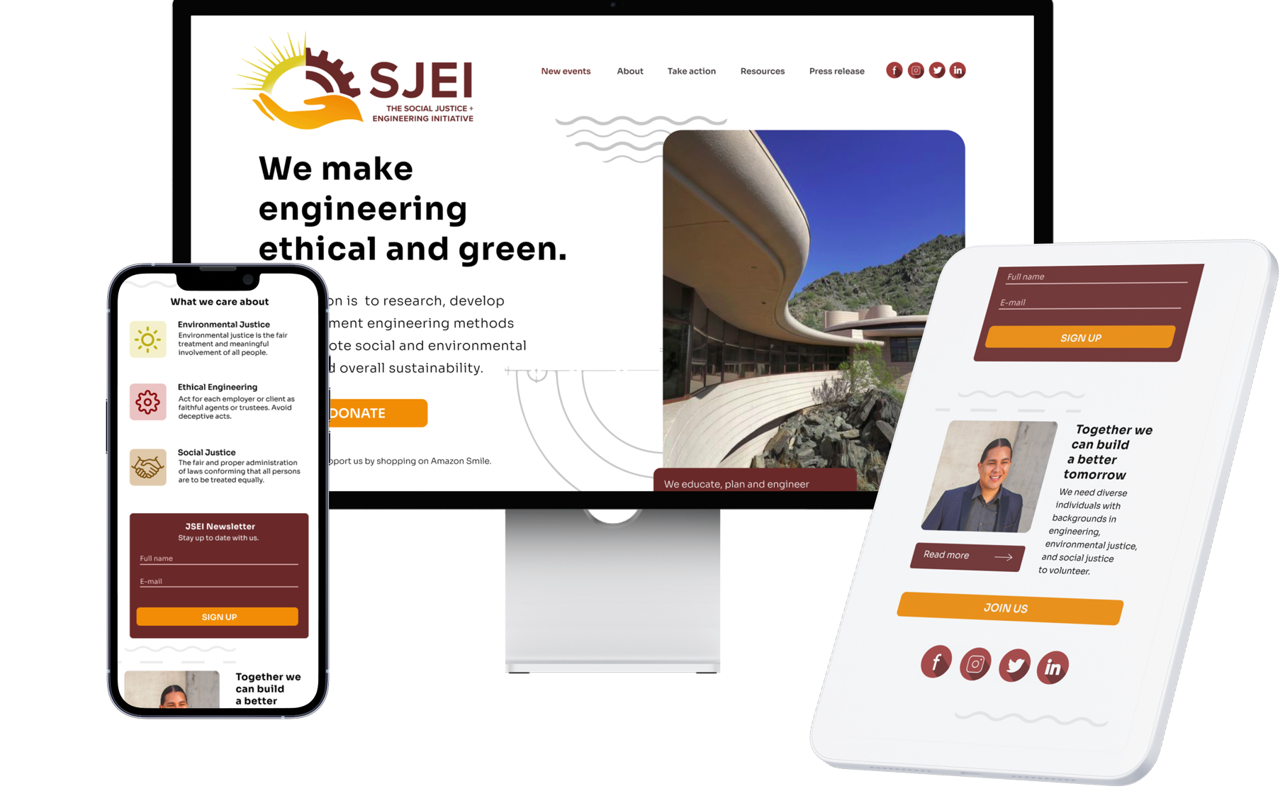
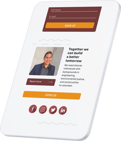
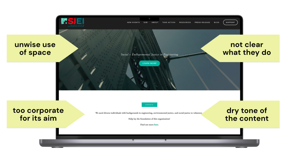
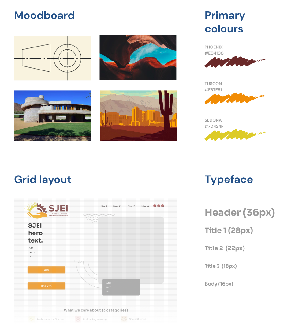
2 weeks, Q4 2021 Responsive design system, NGO, Sustainable Tech Research, UX Writing, UI Design, Testing Figma, Adobe Illustrator, Adobe Photoshop Gestalt principles Creative brief, Brand sprint, Brand attributes, Likert scale, Heuristic review, Moodboards, Competitive analysis, Card sorting, Typographic and colour schemes, Grid definitions, A/B testing 2 weeks, Q4 2021 Responsive design system, NGO, Sustainable Tech Research, UX Writing, UI Design, Testing Figma, Adobe Illustrator, Adobe Photoshop Gestalt principles Creative brief, Brand sprint, Brand attributes, Likert scale, Heuristic review, Moodboards, Competitive analysis, Card sorting, Typographic and colour schemes, Grid definitions, A/B testing WHILE REBRANDING THEIR ONLINE PRESENCE, I WANTED TO REFLECT THE THREE CORE VALUES OF THE CLIENT. FOR THIS REASON, I OPTED FOR THREE BASE COLOURS THAT COULD ALSO INVOKE THE STATE OF ARIZONA WHERE THE CLIENT OPERATES As part of my UX course, I helped an American NGO create a more impactful and user-centric online product. The SJEI website was built using a basic, off-the-shelf template. Moving forward, the organisation wanted to engage more volunteers to promote the principles of ethical and eco-friendly urban planning. The group needed a digital product that could further this agenda. As part of my UX course, I helped an American NGO create a more impactful and user-centric online product. The SJEI website was built using a basic, off-the-shelf template. Moving forward, the organisation wanted to engage more volunteers to promote the principles of ethical and eco-friendly urban planning. The group needed a digital product that could further this agenda. Text-heavy, stock images, black and white palette and barely visible calls for action; for an organisation relying on the support of those who wish to either donate their money or time to the cause, the unmemorable profile of the existing SJEI website was a discouraging picture. The site was cluttered with newsletter sections or “Discover more” cards that hindered the site’s discoverability creating a confusing setting, especially for new visitors who wanted to learn about the NGO’s complex mission in a quick and easy way. Text-heavy, stock images, black and white palette and barely visible calls for action; for an organisation relying on the support of those who wish to either donate their money or time to the cause, the unmemorable profile of the existing SJEI website was a discouraging picture. The site was cluttered with newsletter sections or “Discover more” cards that hindered the site’s discoverability creating a confusing setting, especially for new visitors who wanted to learn about the NGO’s complex mission in a quick and easy way. In light of this feedback, my first goal was to make the Initiative’s ethos more apparent to the user. Accentuating the NGO’s goals would make it easier for its supporters to identify with what SJEI stands for. I invited my colleagues to visit the website and, in an unmoderated round of contextual inquiry, tell me what they believed was the purpose of SJEI. Their responses univocally pointed to the footer that enlisted three core values. In light of this feedback, my first goal was to make the Initiative’s ethos more apparent to the user. Accentuating the NGO’s goals would make it easier for its supporters to identify with what SJEI stands for. I invited my colleagues to visit the website and, in an unmoderated round of contextual inquiry, tell me what they believed was the purpose of SJEI. Their responses univocally pointed to the footer that enlisted three core values. Diving deeper, I employed a couple of methods that helped me translate the Initiative’s ethos into a notable online profile that no one else could duplicate. The brand sprint supplemented with a competitive analysis allowed me to set a distinctive tone for the future product. Delineating two personas of an existing and hopeful volunteer helped me understand which features should become more prominent to meet the audience’s expectations. Diving deeper, I employed a couple of methods that helped me translate the Initiative’s ethos into a notable online profile that no one else could duplicate. The brand sprint supplemented with a competitive analysis allowed me to set a distinctive tone for the future product. Delineating two personas of an existing and hopeful volunteer helped me understand which features should become more prominent to meet the audience’s expectations. I began building a new interface around the 3 core values of ethical engineering, social justice and ecology I had tracked down in my research. To further underscore this trio and the SJEI’s belief in community engagement, I picked 3 colours that invoked the sense of the Arizona region where the NGO was based. Along with the colours, the new design system comprised of the Sora font that best combined the strong structural feel with the sense of locality. I began building a new interface around the 3 core values of ethical engineering, social justice and ecology I had tracked down in my research. To further underscore this trio and the SJEI’s belief in community engagement, I picked 3 colours that invoked the sense of the Arizona region where the NGO was based. Along with the colours, the new design system comprised of the Sora font that best combined the strong structural feel with the sense of locality. A responsive prototype for SJEI offers an optimised and more user-centric experience for those interested in supporting the organisation. Built from a library of iterative components, my product is a ready-to-develop, scalable deliverable that pays attention to Gestalt principles. AS AN NGO, THE CLIENT’S BUSINESS RELIES ON DONATIONS. TO RESPOND TO THE NEED, I DESIGNED A WAY TO ALLOW FOR ONLINE SUPPORT, ACCESSIBLE FROM A PROMINENT CTA ON THE HOME PAGE The new system promotes affordances. Using the same format for various calls for action gives the user the needed clarity about which elements will initiate further action. No more guessing. THE FLOW REPRESENTING THE USER SIGNING UP FOR A NEWSLETTER FROM THE BANNER PRESENT ON THE HOME PAG Setting a rhythm to a page with the inclusion of layout arrangements that repeat through gives the user a sense of familiarity without looking too monotonous or boring. The inclusion of photographs of SJEI members further promotes the feeling of community the group so deeply cares about. DESIGNING A RESPONSIVE VERSION OF THE WEBSITE WAS AN EXERCISE IN ADJUSTING TO THE CONSTRAINTS OF THE MOBILE GRID The use of white space, letter spacing for text as well as margins and paddings around functional elements such as buttons creates an uncluttered and balanced environment where the user can take in the information step by step. “I enjoy how each design decision finds justification and can be traced back to the research results. The product never loses sight of the client’s audience. The beautifully crafted interface encourages the desired sense of Gestalt wholeness.” A responsive prototype for SJEI offers an optimised and more user-centric experience for those interested in supporting the organisation. Built from a library of iterative components, my product is a ready-to-develop, scalable deliverable that pays attention to Gestalt principles. The new system promotes affordances. Using the same format for various calls for action gives the user the needed clarity about which elements will initiate further action. No more guessing. Setting a rhythm to a page with the inclusion of layout arrangements that repeat through gives the user a sense of familiarity without looking too monotonous or boring. The inclusion of photographs of SJEI members further promotes the feeling of community the group so deeply cares about. ❯ OPPOSITE: DESIGNING A RESPONSIVE VERSION OF THE WEBSITE WAS AN EXERCISE IN ADJUSTING TO THE CONSTRAINTS OF THE MOBILE GRID The use of white space, letter spacing for text as well as margins and paddings around functional elements such as buttons creates an uncluttered and balanced environment where the user can take in the information step by step. “I enjoy how each design decision finds justification and can be traced back to the research results. The product never loses sight of the client’s audience. The beautifully crafted interface encourages the desired sense of Gestalt wholeness.” Even the most thorough research won’t make up for a lousy interface. A good visual design is not a matter of taste but a result of carefully made decisions that can help define the brand identity and achieve measurable business goals. Applying Gestalt principles to the elements of the interface strengthened my understanding of visual design and further my interest in creating memorable visual experiences. From the product design perspective, scaling between desktop and mobile versions of the MVP taught me intuitive ways of arranging UI elements for different viewports. Even the most thorough research won’t make up for a lousy interface. A good visual design is not a matter of taste but a result of carefully made decisions that can help define the brand identity and achieve measurable business goals. Applying Gestalt principles to the elements of the interface strengthened my understanding of visual design and further my interest in creating memorable visual experiences. From the product design perspective, scaling between desktop and mobile versions of the MVP taught me intuitive ways of arranging UI elements for different viewports. The Social Justice & Engineering Initiative
DURATION
TYPE OF PROJECT
MY RESPONSIBILITIES
TOOLBOX
PRODUCT DESIGN FRAMEWORKS
UX METHODS
The Social Justice & Engineering Initiative
DURATION
TYPE OF PROJECT
MY RESPONSIBILITIES
TOOLBOX
PRODUCT DESIGN FRAMEWORKS
UX METHODS
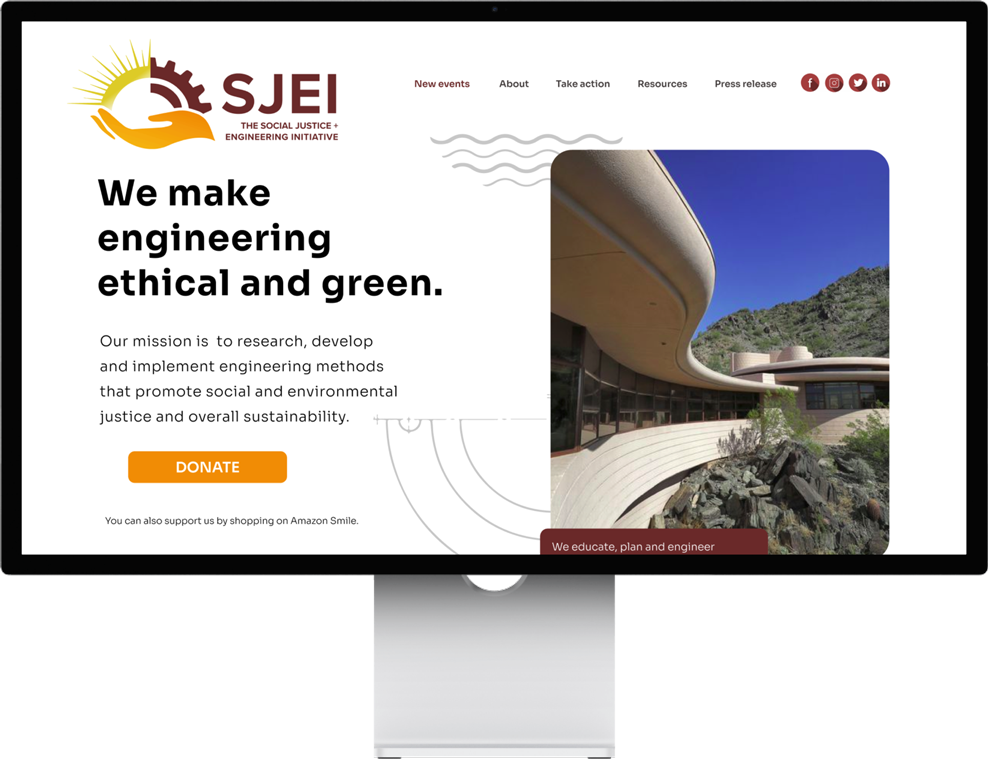
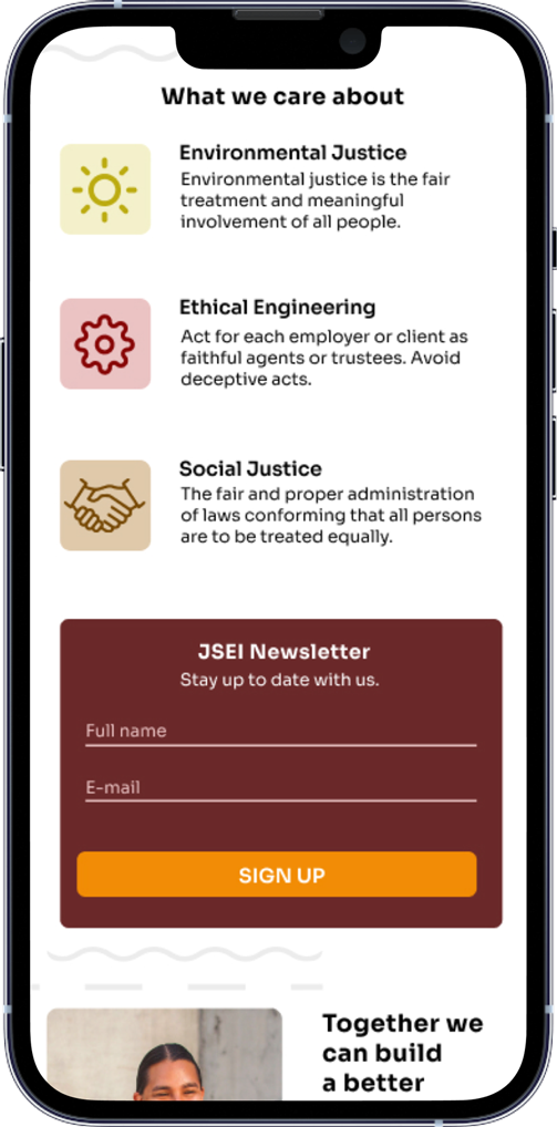


❮ OPPOSITE: WHILE REBRANDING THEIR ONLINE PRESENCE, I WANTED TO REFLECT THE THREE CORE VALUES OF THE CLIENT. FOR THIS REASON, I OPTED FOR THREE BASE COLOURS THAT COULD ALSO INVOKE THE STATE OF ARIZONA WHERE THE CLIENT OPERATES
Problem

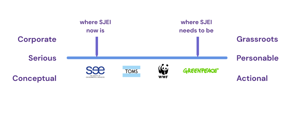
CONCEIVING A BRAND PERSONALITY GRID FOR SJEI GAVE ME A SENSE OF DIRECTION THE FUTURE PRODUCT SHOULD TAKE


⌃ ABOVE: CONCEIVING A BRAND PERSONALITY GRID FOR SJEI GAVE ME A SENSE OF DIRECTION THE FUTURE PRODUCT SHOULD TAKE
Action

Discover
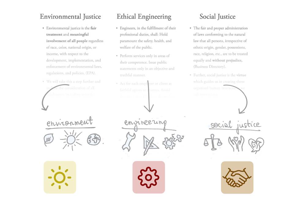
ANALYSING THE MICROCOPY OF THE EXISTING SJEI WEBSITE WAS A CATALYST FOR THE STRUCTURE AND ICONOGRAPHY OF MY NEW PRODUCT
Discover

⌃ ABOVE: ANALYSING THE MICROCOPY OF THE EXISTING SJEI WEBSITE WAS A CATALYST FOR THE STRUCTURE AND ICONOGRAPHY OF MY NEW PRODUCT
Define
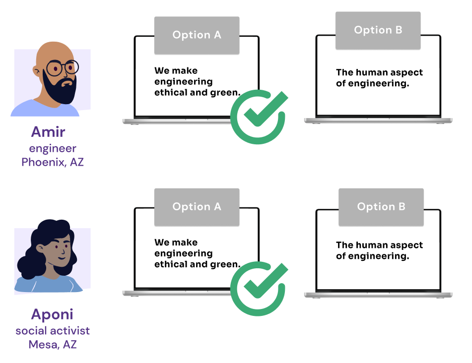
SETTING A NEW TONE IN THE LANGUAGE OF THE NEW WEBSITE REQUIRED A/B TESTING SUBMITTED TO TWO DIGITAL PERSONAS
Define
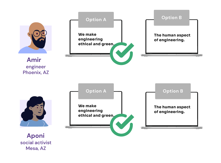
⌃ ABOVE: SETTING A NEW TONE IN THE LANGUAGE OF THE NEW WEBSITE REQUIRED A/B TESTING SUBMITTED TO TWO DIGITAL PERSONAS
Design
Design

Result



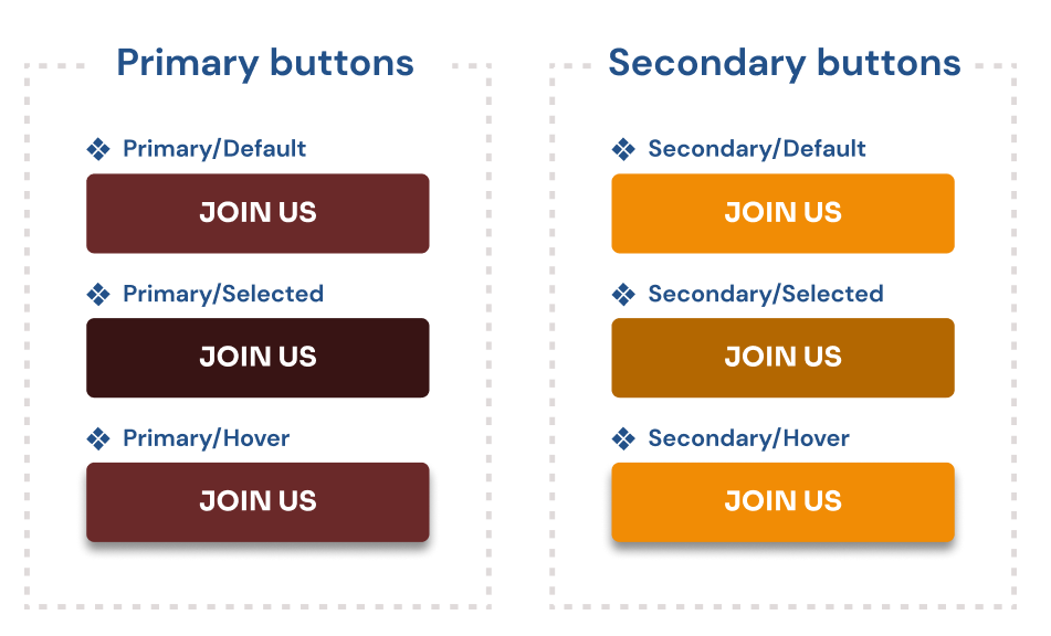
CRAFTING A RESPONSIVE DESIGN SYSTEM WAS A LESSON IN COMPILING A LIBRARY OF ADAPTABLE INTERFACE COMPONENTS

Clementine Brown
DESIGN EDUCATOR AT GENERAL ASSEMBLY

⌃ ABOVE: AS AN NGO, THE CLIENT’S BUSINESS RELIES ON DONATIONS. TO RESPOND TO THE NEED, I DESIGNED A WAY TO ALLOW FOR ONLINE SUPPORT, ACCESSIBLE FROM A PROMINENT CTA ON THE HOME PAGE

❮ OPPOSITE: THE FLOW REPRESENTING THE USER SIGNING UP FOR A NEWSLETTER FROM THE BANNER PRESENT ON THE HOME PAGE


⌃ ABOVE: CRAFTING A RESPONSIVE DESIGN SYSTEM WAS A LESSON IN COMPILING A LIBRARY OF ADAPTABLE INTERFACE COMPONENTS

Clementine Brown
DESIGN EDUCATOR AT GENERAL ASSEMBLY
What I learned


See more of my work
See more of my work
SaaS
E-COMMERCE

NATIVE APPS

WEB SOLUTIONS

ONBOARDING

Problem

Action

Result

What I learned


