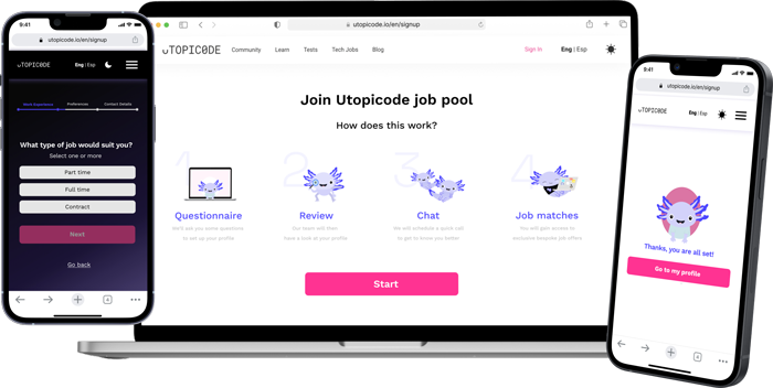
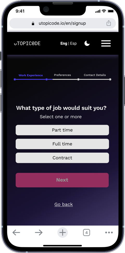
4 weeks, Q4 2021 – Q1 2022 Web and mobile onboarding, Tech recruitment Research, Writing, Product Design, UI Design, Testing Figma, Adobe Illustrator, Adobe Photoshop, Trint, Maze Moscow method, Iceberg method, Decision matrix Surveys, User and stakeholder interviews, Competitive analysis, Persona building, Task analysis, Journey mapping, Userflow, User stories, Prototype feedback session, Quantitative and qualitative testing 4 weeks, Q4 2021 – Q1 2022 Web and mobile onboarding, Tech recruitment Research, Writing, Product Design, UI Design, Testing Figma, Adobe Illustrator, Adobe Photoshop, Trint, Maze Moscow method, Iceberg method, Decision matrix Surveys, User and stakeholder interviews, Competitive analysis, Persona building, Task analysis, Journey mapping, Userflow, User stories, Prototype feedback session, Quantitative and qualitative testing THE WALKTHROUGH SCREENS OFFER THE CHANCE TO ONBOARD A NEW JOINER. AN ANIMATED BREAKDOWN OF FOUR STAGES CLARIFIES THE PROCESS OF FINDING A JOB ON THE UTOPICODE PLATFORM Utopicode, a South American recruitment platform, offers an innovative approach to linking software engineers and UX designers to local job openings on their website. See how my colleague and I implemented new strategies to create a better funnel for collecting necessary data from the new members. Utopicode, a South American recruitment platform, offers an innovative approach to linking software engineers and UX designers to local job openings on their website. See how my colleague and I implemented new strategies to create a better funnel for collecting necessary data from the new members. Client’s analytics indicated an increasingly high bounce rate among novice users asked to set up a profile on the recruiter’s website. Approaching a risky threshold of 60% of the new joiners not completing the process, the Utopicode UX team requested a full overhaul of their current onboarding flow. My colleague, Agata, and I were tasked with reducing the cognitive load of the sign up experience. Our objective was to facilitate the gathering of essential data without compromising on user satisfaction. In preparation for the research stage, we adopted an iceberg model to uncover the motivations behind newcomers’ hesitancy to complete the sign up. We brainstormed a range of reasons as to why users might find the onboarding troublesome. Our intention was to dig deep into the feedback loops from our interviewees and find the root of the problem beyond our initial assumptions. Client’s analytics indicated an increasingly high bounce rate among novice users asked to set up a profile on the recruiter’s website. Approaching a risky threshold of 60% of the new joiners not completing the process, the Utopicode UX team requested a full overhaul of their current onboarding flow. My colleague, Agata, and I were tasked with reducing the cognitive load of the sign up experience. Our objective was to facilitate the gathering of essential data without compromising on user satisfaction. In preparation for the research stage, we adopted an iceberg model to uncover the motivations behind newcomers’ hesitancy to complete the sign up. We brainstormed a range of reasons as to why users might find the onboarding troublesome. Our intention was to dig deep into the feedback loops from our interviewees and find the root of the problem beyond our initial assumptions. The analysis of the problem was two-fold. In the first stage, I was responsible for conducting a series of 12 user interviews and gathering insights on the current onboarding process with two custom-made UX surveys. To supplement the findings of the primary research, I ran competitive and task analyses of our client’s competitors. The analysis of the problem was two-fold. In the first stage, I was responsible for conducting a series of 12 user interviews and gathering insights on the current onboarding process with two custom-made UX surveys. To supplement the findings of the primary research, I ran competitive and task analyses of our client’s competitors. By mapping the main points the users shared with us about the product, we constructed two personas. I wrote a user story and constructed userflows for each of them. Based on these deliverables, we clarified the scope of our task. To address the problem, we needed to create an onboarding experience that was effortless, adaptable and transparent. By mapping the main points the users shared with us about the product, we constructed two personas. I wrote a user story and constructed userflows for each of them. Based on these deliverables, we clarified the scope of our task. To address the problem, we needed to create an onboarding experience that was effortless, adaptable and transparent. We ran a design studio with our client that allowed us to brainstorm the solutions for a better sign-up experience. The result was an iteration of lo-fi sketches followed by mid-fi and high-fi wireframes. With the feedback we had gathered, we were able to come up with a series of screens that alleviated the load of the process through the principle of chunking and process customisation. We ran a design studio with our client that allowed us to brainstorm the solutions for a better sign-up experience. The result was an iteration of lo-fi sketches followed by mid-fi and high-fi wireframes. With the feedback we had gathered, we were able to come up with a series of screens that alleviated the load of the process through the principle of chunking and process customisation. The new Figma high-fidelity flow put forward the case for a new onboarding experience. By adding selection controls and a progress bar, the new sign up journey fosters a sense of effortless continuity. The ability to save the progress or skip the questions underscores the full customisation. Finally, showcasing privacy notices addresses the issue of transparency and how the input data is being handled. A STEP BREAKDOWN OF THE INITIAL QUESTIONNAIRE SERVES AS A ROAD MAP FOR A NOVICE USER. THE INFORMATION CARDS ALERT THE USER AS TO HOW THEIR DATA WILL BE PROCESSED BY UTOPICODE The client appreciated the easiness of the new flow stating that it “created a sense of fast-tracked funnel” that still managed to collect the needed information from the new joiners. ONCE THE QUESTIONNAIRE HAS BEEN COMPLETED, THE USER IS INVITED TO COMPLETE ANY OUTSTANDING ACTIONS FROM THEIR PROFILE PAGE After the sprint has ended, as part of my freelance practice, I took up an additional task of creating a dark mode as well as the mobile version of the onboarding flow. THE LIGHT-TO-DARK TRANSITION ON THE MOBILE VERSION OF THE QUESTIONNAIRE FLOW. THE SWITCH WAS IN SYNC WITH UTOPICODE’S ALREADY EXISTING PRODUCTS The high-fi prototype was tested on 10 users via Maze. The first insights showed no signs of dropping out during the process. The users praised the clarity and easiness of the sign up process. Compared to the sign up process from before, the overall user satisfaction rate went up from 3.6 to 4.7 out of 5. “The new solution facilitates smoother data collection that doesn’t overwhelm the user. It is a great funnel from both the candidate’s and the recruiter’s perspectives. I also appreciate the explanations included in the flow about what Utopicode does. This helps to instil trust in our mission.” The new Figma high-fidelity flow put forward the case for a new onboarding experience. By adding selection controls and a progress bar, the new sign up journey fosters a sense of effortless continuity. The ability to save the progress or skip the questions underscores the full customisation. Finally, showcasing privacy notices addresses the issue of transparency and how the input data is being handled. The client appreciated the easiness of the new flow stating that it “created a sense of fast-tracked funnel” that still managed to collect the needed information from the new joiners. After the sprint has ended, as part of my freelance practice, I took up an additional task of creating a dark mode as well as the mobile version of the onboarding flow. ❯ OPPOSITE: THE LIGHT-TO-DARK TRANSITION ON THE MOBILE VERSION OF THE QUESTIONNAIRE FLOW. THE SWITCH WAS IN SYNC WITH UTOPICODE’S ALREADY EXISTING PRODUCTS The high-fi prototype was tested on 10 users via Maze. The first insights showed no signs of dropping out during the process. The users praised the clarity and easiness of the sign up process. Compared to the sign up process from before, the overall user satisfaction rate went up from 3.6 to 4.7 out of 5. “The new solution facilitates smoother data collection that doesn’t overwhelm the user. It is a great funnel from both the candidate’s and the recruiter’s perspectives. I also appreciate the explanations included in the flow about what Utopicode does. This helps to instil trust in our mission.” From writing up interview plans to implementing user feedback to the high-fi prototype; my work for the Utopicode team was an opportunity to apply my skills to a real-life scenario in a quick and intuitive way. Meeting with the client during the design studio sessions helped me better articulate my design decisions. I also learned how to deliver on the objectives of the project within the agile framework and rely on lean UX methods to manufacture a product that is more digestible to use. From writing up interview plans to implementing user feedback to the high-fi prototype; my work for the Utopicode team was an opportunity to apply my skills to a real-life scenario in a quick and intuitive way. Meeting with the client during the design studio sessions helped me better articulate my design decisions. I also learned how to deliver on the objectives of the project within the agile framework and rely on lean UX methods to manufacture a product that is more digestible to use. Utopicode
DURATION
TYPE OF PROJECT
MY RESPONSIBILITIES
TOOLBOX
PRODUCT DESIGN FRAMEWORKS
UX METHODS
Utopicode
DURATION
TYPE OF PROJECT
MY RESPONSIBILITIES
TOOLBOX
PRODUCT DESIGN FRAMEWORKS
UX METHODS
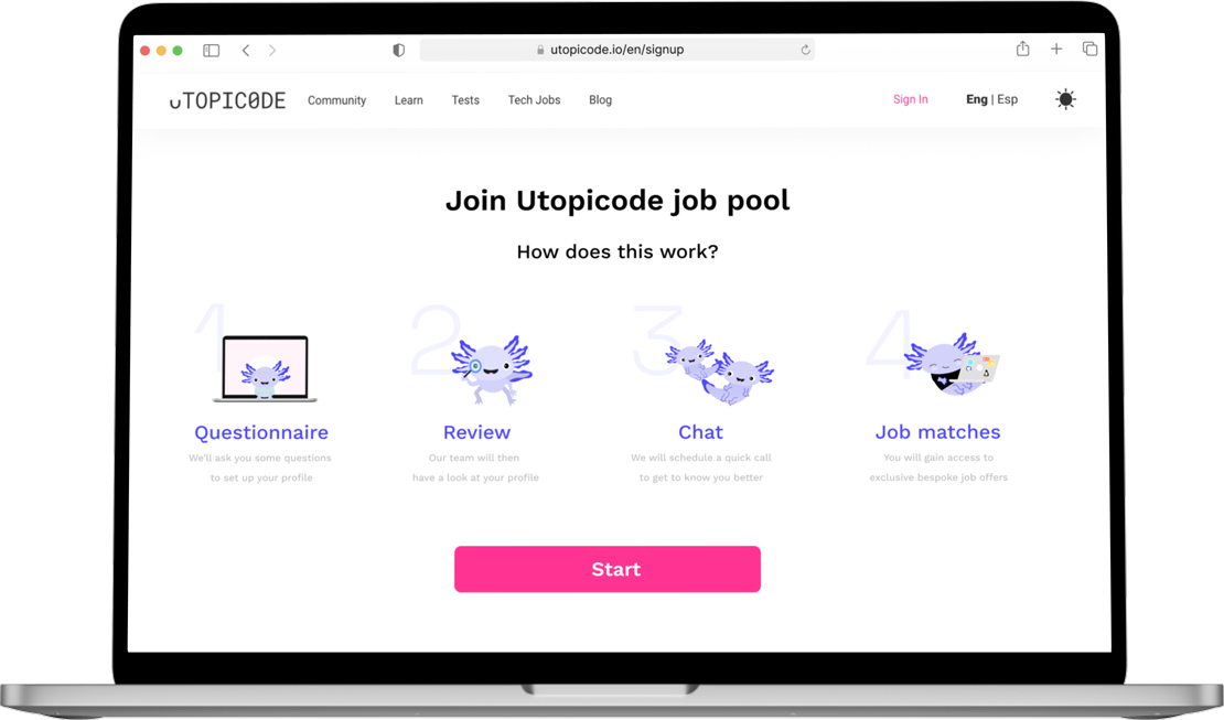


❮ OPPOSITE: THE WALKTHROUGH SCREENS OFFER THE CHANCE TO ONBOARD A NEW JOINER. AN ANIMATED BREAKDOWN OF FOUR STAGES CLARIFIES THE PROCESS OF FINDING A JOB ON THE UTOPICODE PLATFORM
Problem

Quarterly abandonment rate among novice users
Q1 2021
Q2 2021
Q3 2021
SOURCE: UTOPICODE
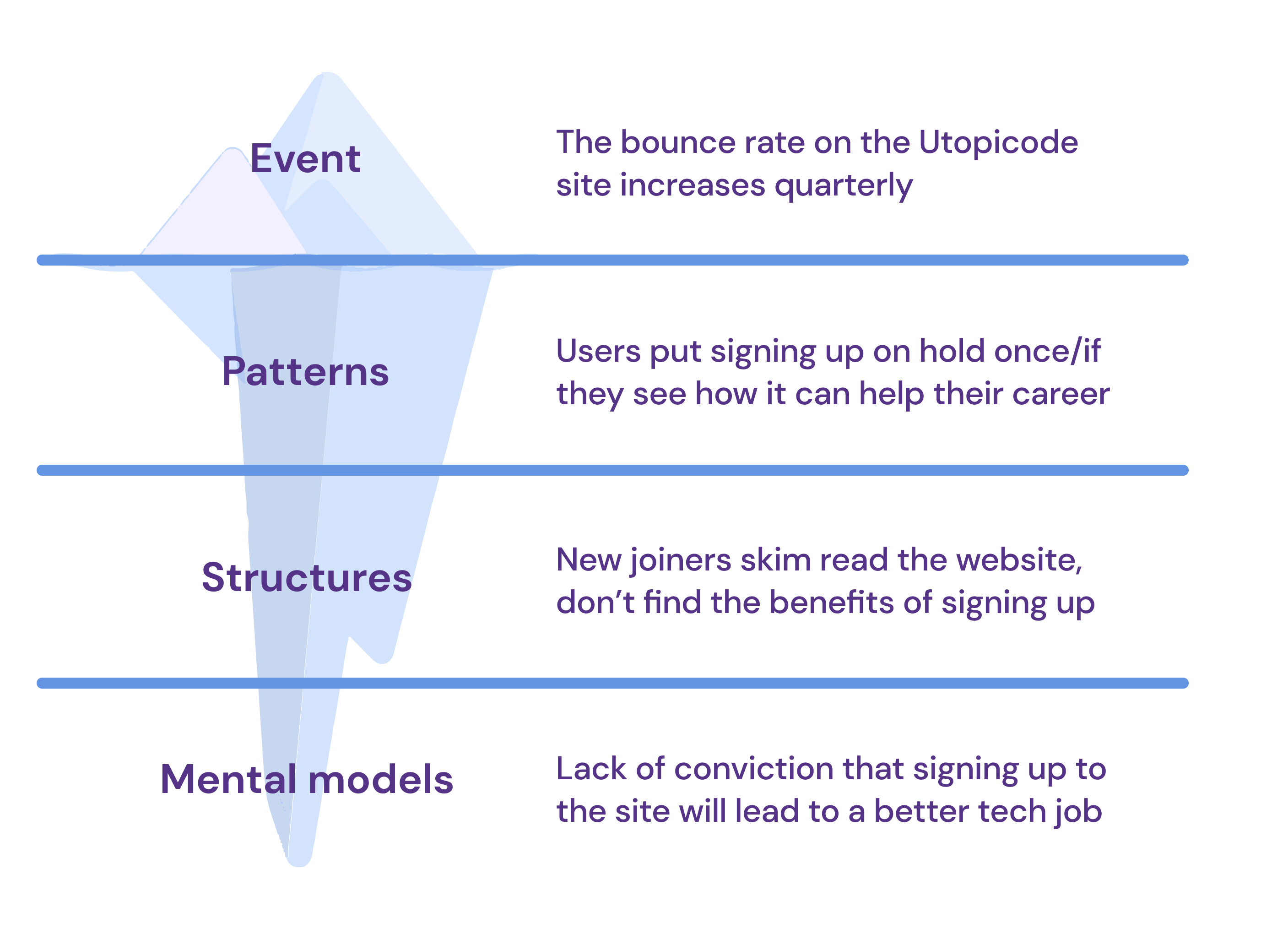
THE ICEBERG METHOD HELPED US CRAFT MORE RIGOROUS INTERVIEW SCRIPTS AND SURVEYS
Quarterly abandonment rate among novice users
Q1 2021
Q2 2021
Q3 2021
SOURCE: UTOPICODE

⌃ ABOVE: THE ICEBERG METHOD HELPED US CRAFT MORE RIGOROUS INTERVIEW SCRIPTS AND SURVEYS
Action

Discover
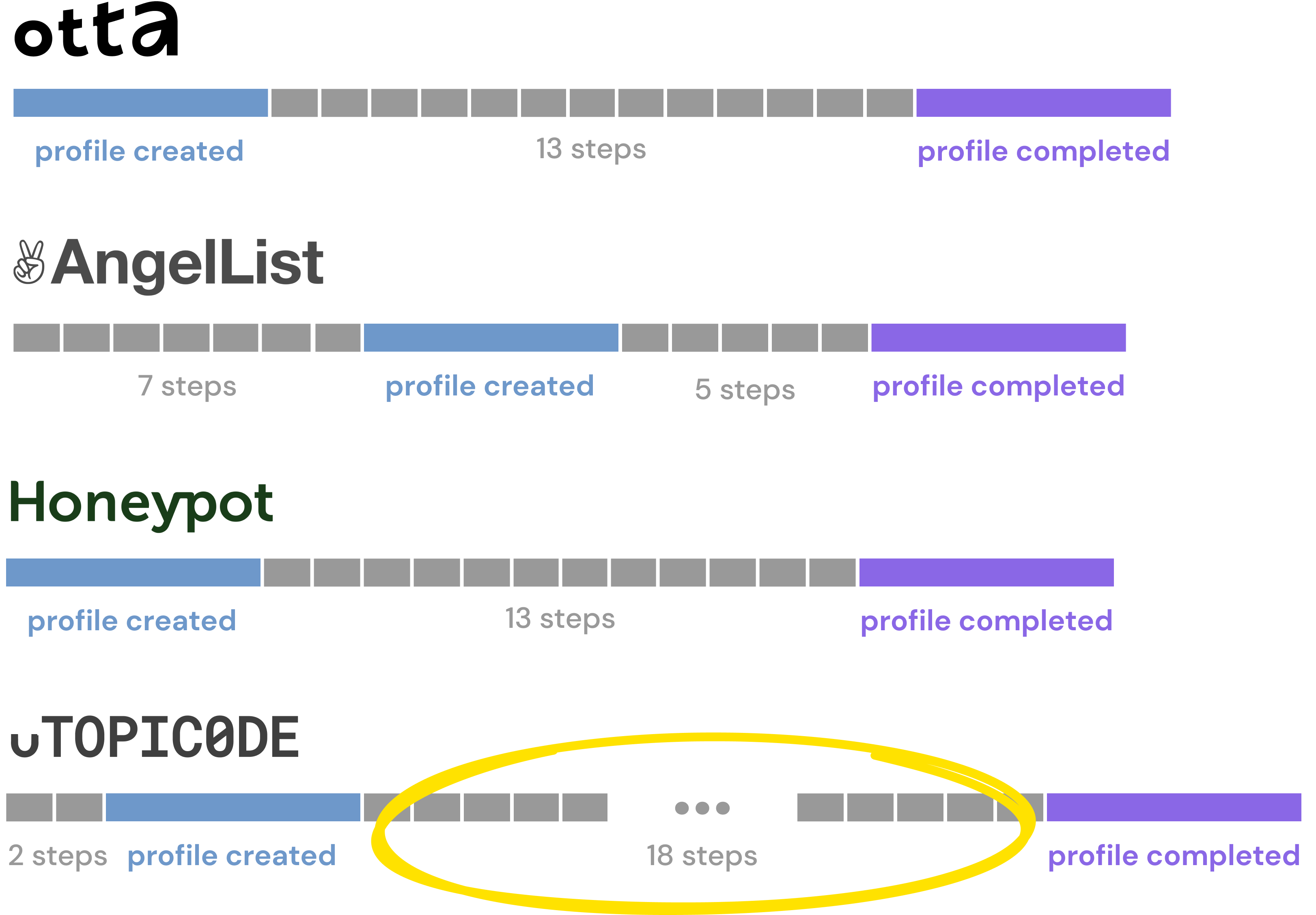
AN EXCERPT FROM THE COMPETITIVE ANALYSIS (SIGN UP PROCESS ON COMPARABLE TECH RECRUITMENT PLATFORMS)
Discover

⌃ ABOVE: AN EXCERPT FROM THE COMPETITIVE ANALYSIS (SIGN UP PROCESS ON COMPARABLE TECH RECRUITMENT PLATFORMS)
Define
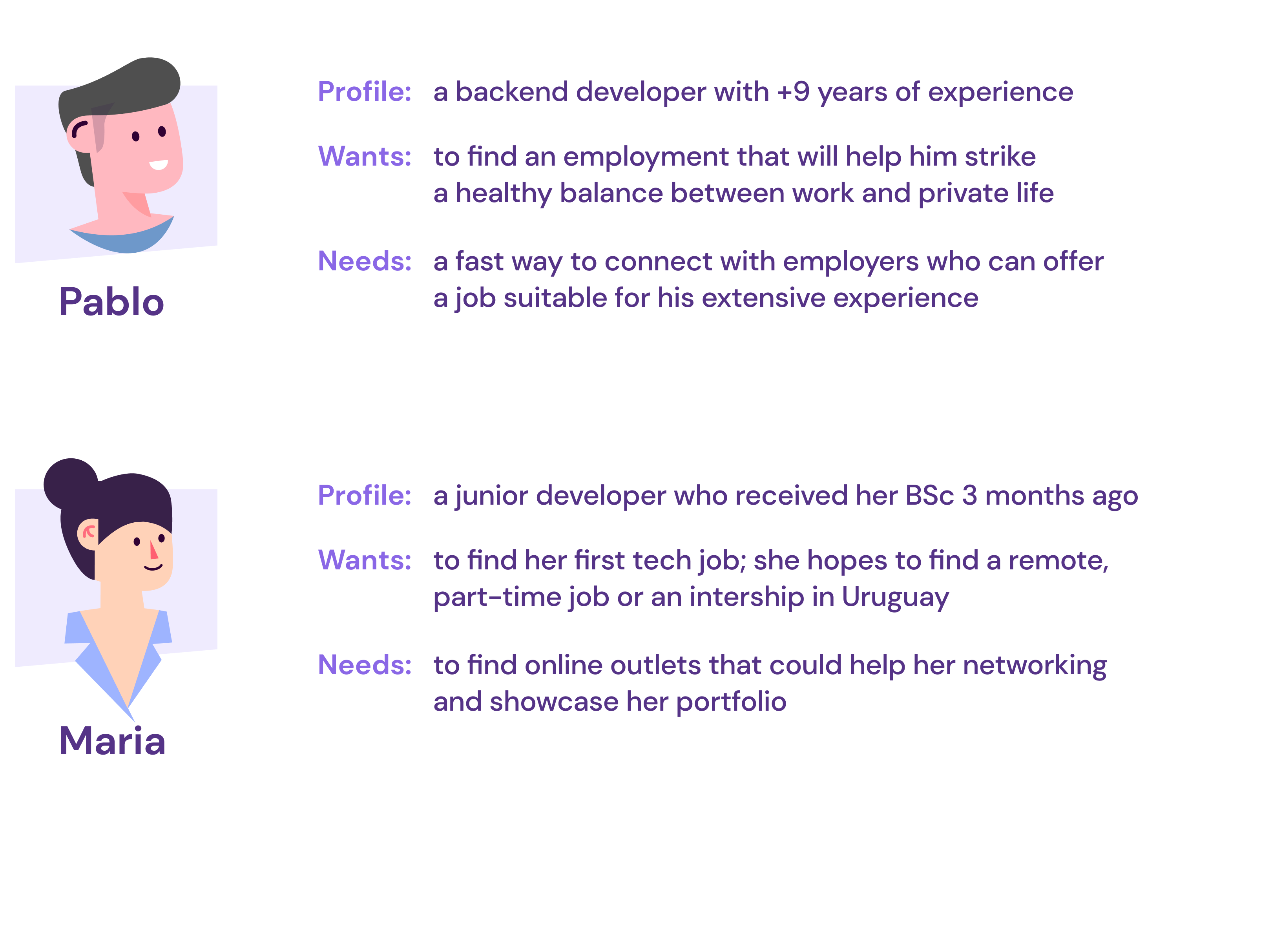
SKETCHING OUT THE PERSONAS
Define
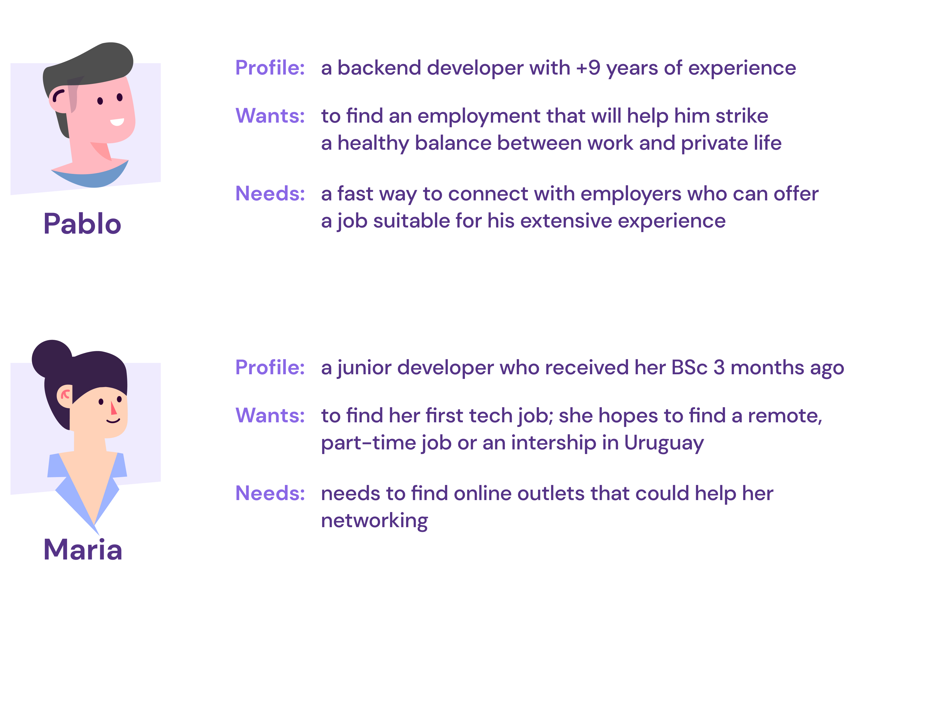
⌃ ABOVE: SKETCHING OUT THE PERSONAS
Design
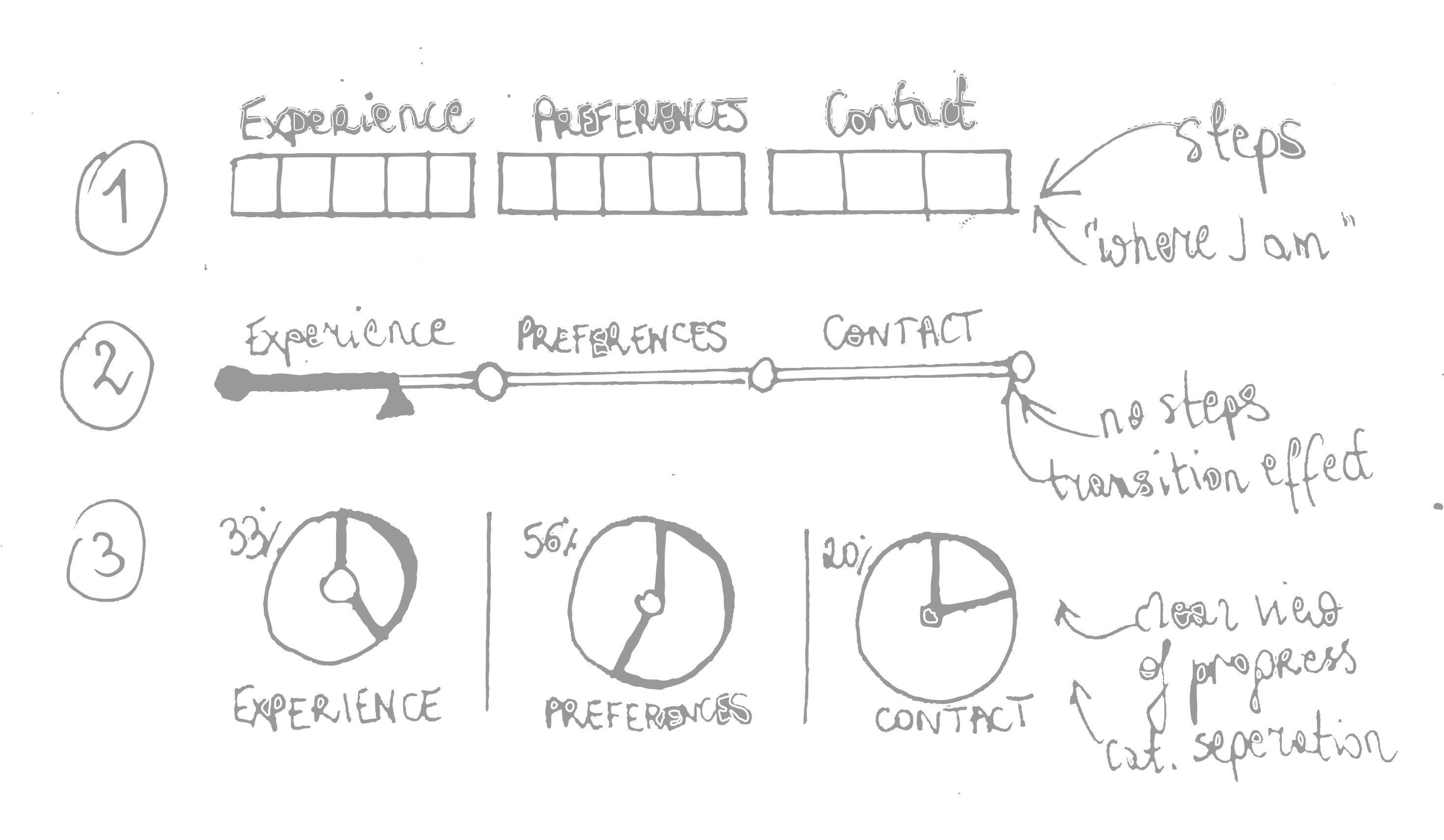
LO-FI SKETCHES OF PROGRESS BAR ITERATIONS PRESENTED TO THE CLIENT DURING THE DESIGN STUDIO SESSION
Design

⌃ ABOVE: LO-FI SKETCHES OF PROGRESS BAR ITERATIONS PRESENTED TO THE CLIENT DURING THE DESIGN STUDIO SESSION
Result




Fernando Poli
UX/UI DESIGNER AT UTOPICODE

⌃ ABOVE: A STEP BREAKDOWN OF THE INITIAL QUESTIONNAIRE SERVES AS A ROAD MAP FOR A NOVICE USER. THE INFORMATION CARDS ALERT THE USER AS TO HOW THEIR DATA WILL BE PROCESSED BY UTOPICODE

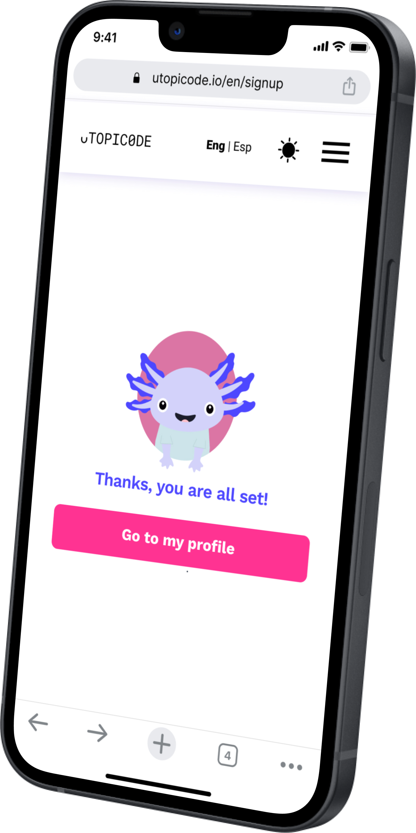
❮ OPPOSITE: ONCE THE QUESTIONNAIRE HAS BEEN COMPLETED, THE USER IS INVITED TO COMPLETE ANY OUTSTANDING ACTIONS FROM THEIR PROFILE PAGE


Fernando Poli
UX/UI DESIGNER AT UTOPICODE
What I learned


See more of my work
E-COMMERCE
WEB SOLUTIONS
DESIGN SYSTEMS
See more of my work
SaaS
NATIVE APPS

WEB SOLUTIONS

DESIGN SYSTEMS

Problem

Action

Result

What I learned


