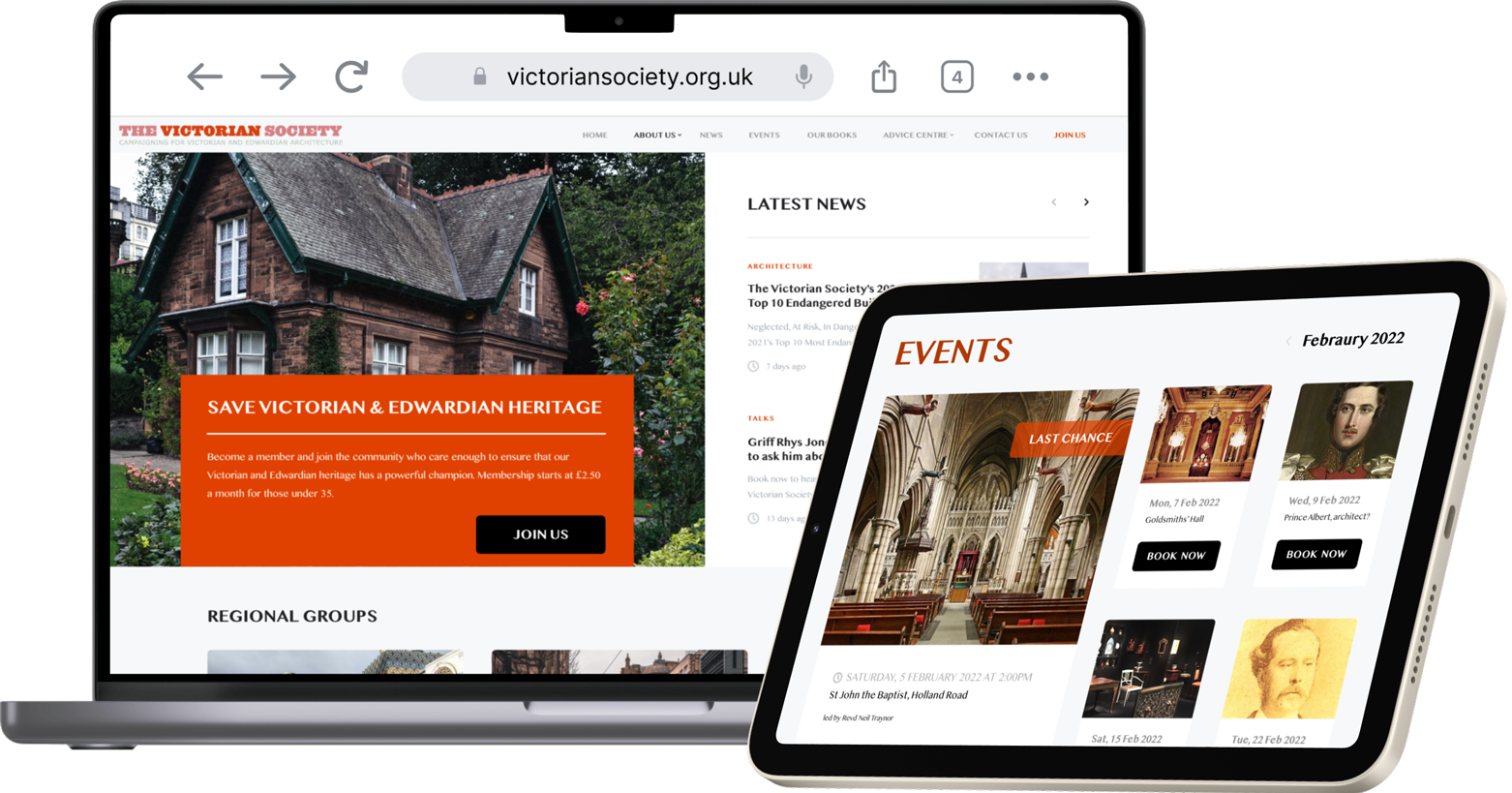
4 weeks, Q1 2022 – Q2 2022 Website overhaul, Arts and heritage Research, Information Architecture, Product Design, UX Strategy, UI Design Adobe XD, Adobe Illustrator, WordPress, Trello, Maze First principles, Requirements and constraints, Impact-Effort matrix Contextual inquiry, Surveys, User and stakeholder interviews, Card sorting, Persona building, Task analysis, Journey mapping, Userflow, Prototype feedback session, Heat maps, Analytics review 4 weeks, Q1 2022 – Q2 2022 Website overhaul, Arts and heritage Research, Information Architecture, Product Design, UX Strategy, UI Design Adobe XD, Adobe Illustrator, WordPress, Trello, Maze First principles, Requirements and constraints, Impact-Effort matrix Contextual inquiry, Surveys, User and stakeholder interviews, Card sorting, Persona building, Task analysis, Journey mapping, Userflow, Prototype feedback session, Heat maps, Analytics review UPON SELECTING THE REGIONAL GROUP OF THE SOCIETY FROM THE INTERACTIVE MAP, THE USER IS SENT TO THE REBRANDED WEBSITE The Victorian Society is dedicated to protecting the Victorian heritage across the UK. The group’s director, Joe, asked me to evaluate their existing website and improve its functionality. Following our meeting, I was able to establish that the website served a twofold purpose: to encourage volunteers and donors to support the cause and to generate income from book and event ticket sales. The Victorian Society is dedicated to protecting the Victorian heritage across the UK. The group’s director, Joe, asked me to evaluate their existing website and improve its functionality. Following our meeting, I was able to establish that the website served a twofold purpose: to encourage volunteers and donors to support the cause and to generate income from book and event ticket sales. A few days and Zoom calls later, I met with the members of the society to better understand what the potential pain points of the existing product might be. For my research method, I opted for a contextual inquiry. This allowed me to hear unmoderated feedback and see how well the website served its purpose when the user was prompted with a task to complete. I instructed the participants to book an event on the society’s website or to try to enlist as a volunteer. Their frustration about finding the relevant sections on the landing corroborated my assumption that the website suffered from the home page syndrome. The site was a catchall of crammed news bulletins, overloaded banners and social media feeds. A few days and Zoom calls later, I met with the members of the society to better understand what the potential pain points of the existing product might be. For my research method, I opted for a contextual inquiry. This allowed me to hear unmoderated feedback and see how well the website served its purpose when the user was prompted with a task to complete. I instructed the participants to book an event on the society’s website or to try to enlist as a volunteer. Their frustration about finding the relevant sections on the landing corroborated my assumption that the website suffered from the home page syndrome. The site was a catchall of crammed news bulletins, overloaded banners and social media feeds. I needed to devise a way to declutter the crowded place that this website has become. To improve the site’s navigability, I supplemented my research with a Maze survey that helped me gather the stakeholder opinions about the site’s current look. The testers pointed out that the scarcity of colour and lack of hierarchy on the site leaves the visitor unengaged and disoriented as to where to click on. I needed to devise a way to declutter the crowded place that this website has become. To improve the site’s navigability, I supplemented my research with a Maze survey that helped me gather the stakeholder opinions about the site’s current look. The testers pointed out that the scarcity of colour and lack of hierarchy on the site leaves the visitor unengaged and disoriented as to where to click on. I began to understand what was amiss in the user’s interaction with the product. I met once again with the client to discuss what type of Minimal Viable Product would be the best preview for a new product given a strict timeframe. Using the requirements and constraints framework, we decided that three interfaces that should be presented to the stakeholders at the end of the sprint were: the Home, Events and Books pages. I began to understand what was amiss in the user’s interaction with the product. I met once again with the client to discuss what type of Minimal Viable Product would be the best preview for a new product given a strict timeframe. Using the requirements and constraints framework, we decided that three interfaces that should be presented to the stakeholders at the end of the sprint were: the Home, Events and Books pages. Back at the drawing board, I wanted to underscore society’s contribution to heritage protection. With the introduction of red brick tones, the monotony of the existing product gives way to the colour blocking that restores a much-needed hierarchy. To address the cluttered navigation, I asked the stakeholders which categories they would prioritise if they were to donate or simply wanted to buy one of the books from the e-shop. Back at the drawing board, I wanted to underscore society’s contribution to heritage protection. With the introduction of red brick tones, the monotony of the existing product gives way to the colour blocking that restores a much-needed hierarchy. To address the cluttered navigation, I asked the stakeholders which categories they would prioritise if they were to donate or simply wanted to buy one of the books from the e-shop. The new home page offers a fresh and uncluttered environment that fosters better learnability through the use of familiar elements such as the hero banner or draggable carrousels. The priority is given to the society’s mission to recruit more members with an explanatory note on how to help the cause. THE NEW WEBSITE BREAKS THROUGH THE NOISE OF THE PREVIOUSLY CLUTTERED ENVIRONMENT AND PUSHES TO THE FRONT THE MOST PROMINENT ASPECTS OF THE SOCIETY’S ACTIVITY The new e-shop page allows the users to browse through the books with the cards replacing the text-heavy look of the previous website. Enough details and a dominant cover picture serve as an inviting entry point to the purchase. I MADE ROOM FOR THE E-COMMERCE SIDE OF MY CLIENT’S BUSINESS, NOW ACCESSIBLE FROM THE TOP NAVIGATION BAR The event calendar with the navigation selector gives the user a choice to see the overview of other months. The language of the microcopy (“Last chance”) encourages the user to book a ticket. THE EVENTS PAGE ALLOWS FOR AN OVERALL VIEW AS WELL AS THE MONTH-BY-MONTH VERSION. THE USER CAN FURTHER FILTER THE RESULTS THROUGH A CALENDAR OVERLAY The clickable prototype was sent for a round of testing via Maze where I could observe the behavioural patterns of testers towards the new product. Using the heat map technique, I was able to note a decrease in the rate of misclicks by 75% when prompted with the same tasks I had previously asked my users to complete in the contextual enquiry. “[Adam] approached things logically speaking to those who used the website and ourselves to ensure he understood our objectives. He was happy to then further refine things as our ideas developed seeing things in the flesh.” The new home page offers a fresh and uncluttered environment that fosters better learnability through the use of familiar elements such as the hero banner or draggable carrousels. The priority is given to the society’s mission to recruit more members with an explanatory note on how to help the cause. The new e-shop page allows the users to browse through the books with the cards replacing the text-heavy look of the previous website. Enough details and a dominant cover picture serve as an inviting entry point to the purchase. The event calendar with the navigation selector gives the user a choice to see the overview of other months. The language of the microcopy (“Last chance”) encourages the user to book a ticket. ❯ OPPOSITE: THE EVENTS PAGE ALLOWS FOR AN OVERALL VIEW AS WELL AS THE MONTH-BY-MONTH VERSION. THE USER CAN FURTHER FILTER THE RESULTS THROUGH A CALENDAR OVERLAY The clickable prototype was sent for a round of testing via Maze where I could observe the behavioural patterns of testers towards the new product. Using the heat map technique, I was able to note a decrease in the rate of misclicks by 75% when prompted with the same tasks I had previously asked my users to complete in the contextual enquiry. “[Adam] approached things logically speaking to those who used the website and ourselves to ensure he understood our objectives. He was happy to then further refine things as our ideas developed seeing things in the flesh.” Working for the Victorian Society was a lesson in meeting the needs of the client against the time and effort constraints. It taught me how to develop a succinct viable product that addressed the existing pain points revealed in my research. The prototype was also a chance for me to improve my UX writing skills. From changing the words in the headers to editing the microcopy of the e-shop, I got to elaborate a new tone for the website that coveys the respectability and the enthusiasm of my client’s brand. Working for the Victorian Society was a lesson in meeting the needs of the client against the time and effort constraints. It taught me how to develop a succinct viable product that addressed the existing pain points revealed in my research. The prototype was also a chance for me to improve my UX writing skills. From changing the words in the headers to editing the microcopy of the e-shop, I got to elaborate a new tone for the website that coveys the respectability and the enthusiasm of my client’s brand. Victorian Society
DURATION
TYPE OF PROJECT
MY RESPONSIBILITIES
TOOLBOX
PRODUCT DESIGN FRAMEWORKS
UX METHODS
Victorian Society
DURATION
TYPE OF PROJECT
MY RESPONSIBILITIES
TOOLBOX
PRODUCT DESIGN FRAMEWORKS
UX METHODS
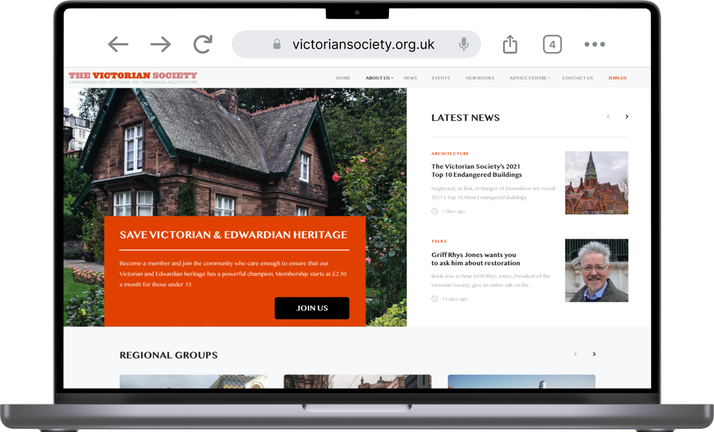
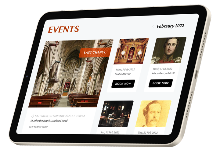


❮ OPPOSITE: UPON SELECTING THE REGIONAL GROUP OF THE SOCIETY FROM THE INTERACTIVE MAP, THE USER IS SENT TO THE REBRANDED WEBSITE
Problem

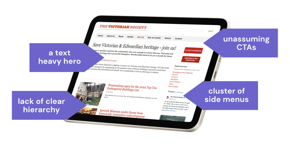
BREAKING DOWN THE PAIN POINTS OF THE EXISTING WEBSITE IN A HEURISTIC EVALUATION
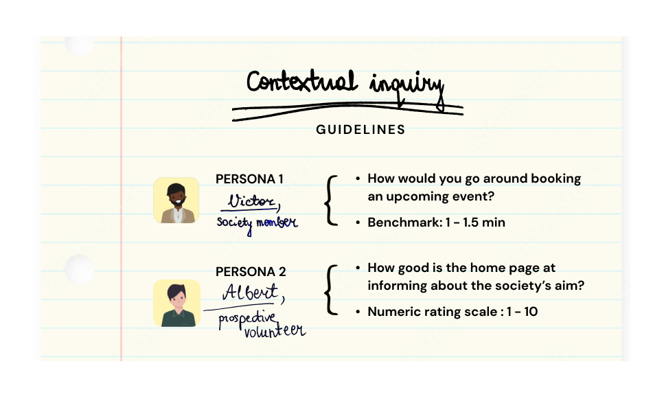
I DRAFTED A RESEARCH PLAN ADAPTED TO THE PRODUCT’S TWO MAIN USER GROUPS

⌃ ABOVE: BREAKING DOWN THE PAIN POINTS OF THE EXISTING WEBSITE IN A HEURISTIC EVALUATION

⌃ ABOVE: I DRAFTED A RESEARCH PLAN ADAPTED TO THE PRODUCT’S TWO MAIN USER GROUPS
Action

Discover
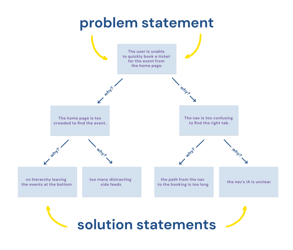
REPEATEDLY ASKING “WHY” USING THE FIRST PRINCIPLES FRAMEWORK WAS KEY IN DETERMINING WHICH AREAS SHOULD BE PRIORITISED ON THE NEW WEBSITE
Discover
⌃ ABOVE: REPEATEDLY ASKING “WHY” USING THE FIRST PRINCIPLES FRAMEWORK WAS KEY IN DETERMINING WHICH AREAS SHOULD BE PRIORITISED ON THE NEW WEBSITE
Define
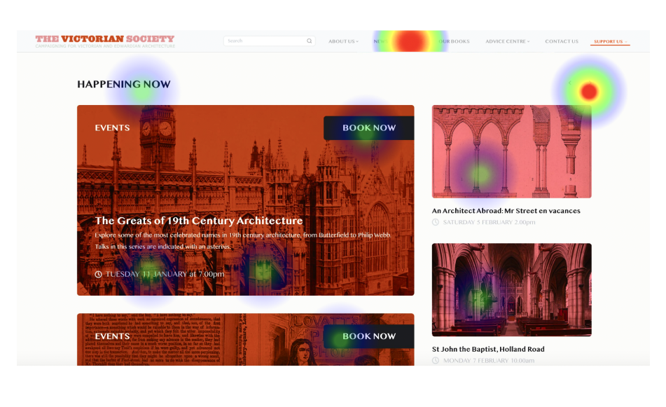
THE HEAT MAPS HELPED ME VERIFY AND FINESSE THE FUNCTIONALITY OF THE SUCCESSIVE ITERATIONS OF THE NEW PRODUCT (SOURCE: MAZE)
Define

⌃ ABOVE: THE HEAT MAPS HELPED ME VERIFY AND FINESSE THE FUNCTIONALITY OF THE SUCCESSIVE ITERATIONS OF THE NEW PRODUCT (SOURCE: MAZE)
Design
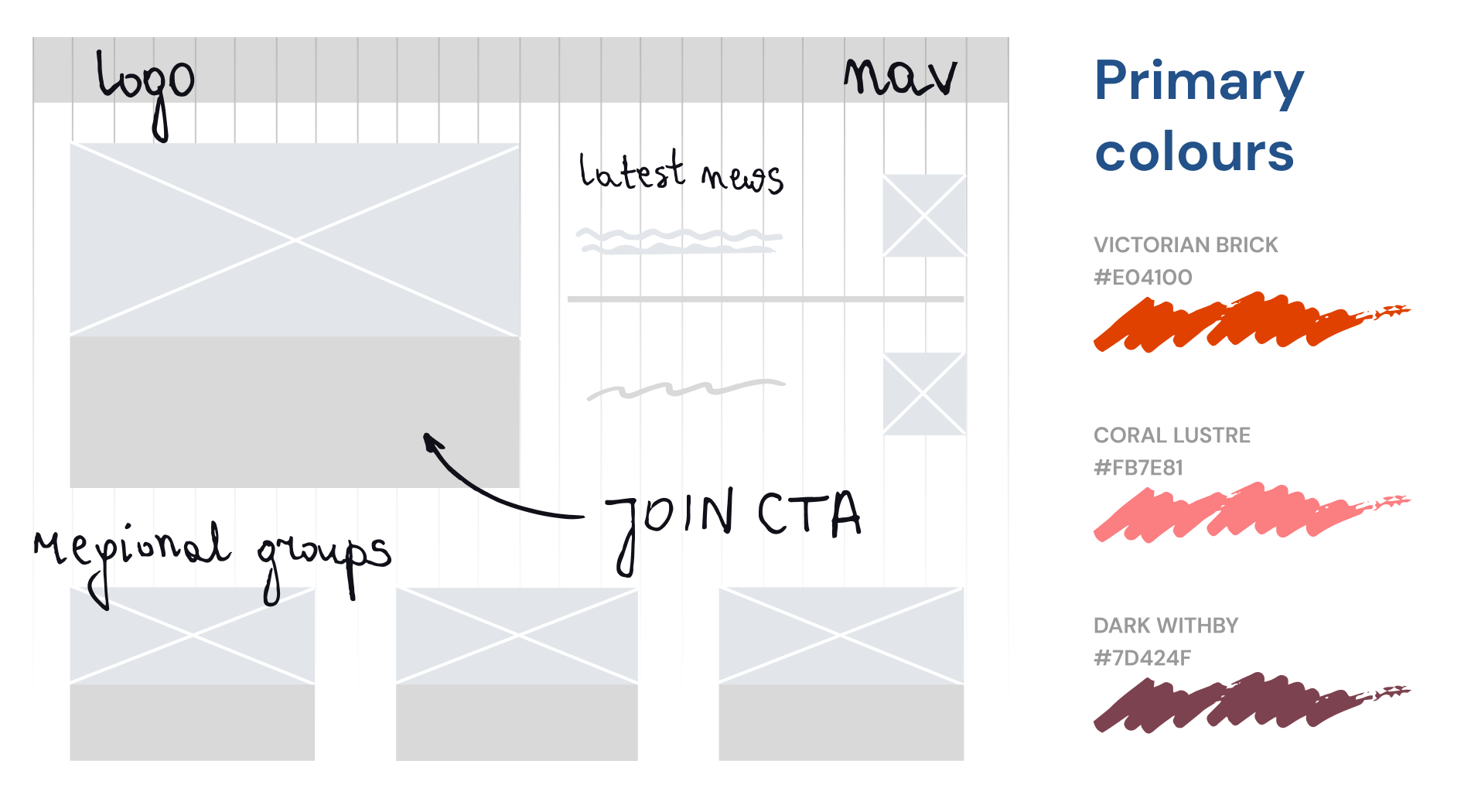
SKETCHING OUT THE UI COMPONENTS
Design

⌃ ABOVE: SKETCHING OUT THE UI COMPONENTS
Result


Joe O'Donnell
DIRECTOR OF THE VICTORIAN SOCIETY

⌃ ABOVE: THE NEW WEBSITE BREAKS THROUGH THE NOISE OF THE PREVIOUSLY CLUTTERED ENVIRONMENT AND PUSHES TO THE FRONT THE MOST PROMINENT ASPECTS OF THE SOCIETY’S ACTIVITY

❮ OPPOSITE: I MADE ROOM FOR THE E-COMMERCE SIDE OF MY CLIENT’S BUSINESS, NOW ACCESSIBLE FROM THE TOP NAVIGATION BAR


Joe O'Donnell
DIRECTOR OF THE VICTORIAN SOCIETY
What I learned


See more of my work
See more of my work
SaaS
E-COMMERCE

NATIVE APPS

ONBOARDING

DESIGN SYSTEMS

Problem

Action

Result

What I learned


